The modern living room has evolved into a canvas for personal expression, where every element contributes to the overall aesthetic narrative. Among the most powerful yet underutilized tools for interior transformation are graphic cushions, which possess the remarkable ability to breathe life into neutral spaces and create dynamic focal points. These decorative elements transcend their functional purpose, becoming artistic statements that reflect contemporary design sensibilities whilst maintaining the essential comfort we seek in our living spaces.
Graphic cushions represent a sophisticated approach to interior styling, offering an immediate solution for homeowners seeking to revitalize their existing furniture without committing to extensive renovations. The strategic placement of bold patterns and geometric designs can dramatically alter spatial perception, creating visual interest that draws the eye and establishes a modern, curated atmosphere. Whether you’re working with a minimalist Scandinavian sofa or a traditional three-seater, the right selection of graphic cushions can bridge design eras and create harmonious yet exciting compositions.
Geometric pattern psychology in contemporary interior design
The psychological impact of geometric patterns in interior spaces extends far beyond mere aesthetic appeal, influencing how occupants perceive and interact with their environment. Contemporary research in environmental psychology demonstrates that angular motifs and structured designs create a sense of order and sophistication, whilst simultaneously energizing spaces through visual complexity. This dual effect makes geometric cushions particularly effective in modern living rooms, where balance between calm and stimulation is paramount.
Visual weight distribution through angular motifs
Angular motifs carry inherent visual weight that can be strategically deployed to balance room compositions. Sharp lines and defined shapes create anchoring points that stabilize furniture arrangements, particularly beneficial when working with lightweight or visually understated sofas. The key lies in understanding how these patterns interact with existing architectural elements, ensuring that graphic cushions complement rather than compete with window frames, doorways, and built-in features.
Consider how triangular patterns naturally draw the eye upward, making them ideal for low-profile seating arrangements that require vertical emphasis. Conversely, horizontal stripe patterns can extend the perceived width of narrow living spaces, creating an illusion of expanded square footage. The strategic application of these principles allows interior designers to manipulate spatial perception through carefully selected cushion graphics.
Colour temperature impact on spatial perception
The colour temperature of graphic patterns significantly influences how spaces feel and function throughout different times of day. Warm-toned geometric designs in amber, rust, and deep gold create cosy environments that encourage relaxation and intimate conversation. These colours work particularly well in north-facing rooms or spaces with limited natural light, where cooler tones might feel stark or unwelcoming.
Cool-toned graphics featuring blues, greys, and crisp whites expand perceived space whilst promoting mental clarity and focus. These colours excel in open-plan living areas where maintaining a sense of spaciousness is crucial. The interplay between warm and cool elements within a single graphic design can create dynamic tension that prevents spaces from feeling monotonous or predictable.
Scale proportion guidelines for standard Three-Seater sofas
Proportional relationships between cushion graphics and sofa dimensions require careful consideration to achieve visual harmony. For standard three-seater sofas measuring approximately 200-220cm in length, medium-scale patterns ranging from 15-25cm repeat intervals typically provide optimal balance. Smaller patterns can appear busy or insignificant from typical viewing distances, whilst oversized graphics may overwhelm the furniture’s proportions.
The golden ratio principle applies effectively when selecting graphic scales, with pattern elements ideally maintaining a 1:1.618 relationship to surrounding visual elements. This mathematical approach ensures that cushion graphics feel naturally integrated rather than arbitrarily applied, contributing to the overall sophisticated appearance of the living space.
Contrast ratio optimisation between upholstery and cushion graphics
Achieving the perfect contrast ratio between sofa upholstery and graphic cushions requires understanding both tonal values and pattern density. High-contrast combinations, such as bold black geometric patterns on cream upholstery, create dramatic focal points that command attention. However, these striking combinations must be balanced with neutral elements to prevent visual fatigue.
Medium contrast approaches often prove more versatile for everyday living, allowing graphic cushions to enhance rather than dominate the space. Consider how different lighting conditions throughout the day will affect contrast perception, ensuring that your chosen combinations remain effective from morning natural light through evening artificial illumination.
High-performance fabric technologies for graphic cushion applications
The evolution of textile manufacturing has revolutionized the durability and maintenance requirements of decorative cushions, making it possible to enjoy bold graphic designs without compromising on practicality. Modern fabric technologies address the traditional challenges associated with patterned textiles, including colour fastness, stain resistance, and structural integrity under regular use. Understanding these technological advances enables informed decision-making when investing in quality graphic cushions that will maintain their visual impact over time.
Digital textile printing techniques on Linen-Cotton blends
Advanced digital printing technologies have transformed the possibilities for graphic cushion production, enabling precise colour reproduction and intricate pattern details that were previously impossible to achieve. Reactive dye systems penetrate deeply into natural fiber structures, creating permanent colour bonds that resist fading and bleeding. This technology proves particularly effective on linen-cotton blends, which offer the perfect balance of durability and texture for contemporary interiors.
The precision of digital printing allows for photorealistic reproductions of architectural elements, creating cushions that can mirror ceiling details or wall moldings for sophisticated coordination schemes. This technological advancement has democratized custom pattern creation, making bespoke graphic designs accessible to residential consumers who previously relied on limited mass-production options.
Fade resistance properties in sunbrella performance fabrics
Sunbrella’s solution-dyed acrylic technology represents a breakthrough in outdoor fabric performance that translates beautifully to indoor applications. The dyeing process occurs before fiber extrusion, ensuring that colour penetrates throughout the material structure rather than merely coating the surface. This fundamental difference provides exceptional fade resistance that maintains graphic integrity even in south-facing windows with intense sunlight exposure.
Performance fabrics have eliminated the traditional trade-off between bold graphics and practical durability, enabling homeowners to embrace striking patterns without fear of premature deterioration.
Crypton stain protection technology for High-Traffic seating
Crypton’s liquid barrier technology creates an invisible protective layer that prevents spills from penetrating fabric fibers whilst maintaining the natural texture and breathability of the base material. This innovation proves invaluable for graphic cushions in family environments or entertainment spaces where accidents are inevitable. The technology works at the molecular level, creating permanent protection that cannot wash out or wear away over time.
Unlike traditional stain treatments that can alter fabric hand or create stiffness, Crypton protection maintains the original drape and feel of luxury textiles. This makes it possible to enjoy delicate silk blends or fine cotton percales in graphic patterns without compromising on practical performance requirements.
Microfibre durability standards for repeated washing cycles
Modern microfibre constructions designed specifically for home textiles have achieved remarkable durability benchmarks, with premium grades withstanding over 50,000 abrasion cycles whilst maintaining pattern clarity. The synthetic nature of these fibers provides inherent stain resistance and quick-drying properties that simplify maintenance routines for busy households.
The development of solution-dyed polyester microfibers has created cushion options that combine the easy-care properties of synthetic materials with the visual richness traditionally associated with natural textiles. These advances make graphic cushions particularly suitable for homes with children or pets, where frequent cleaning is necessary.
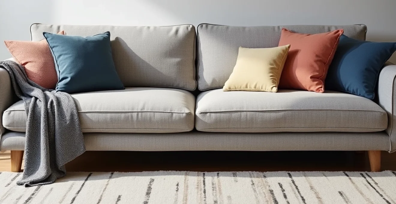
Strategic cushion arrangement methodologies for maximum visual impact
The arrangement of graphic cushions requires a sophisticated understanding of visual balance, proportion, and rhythm to achieve maximum decorative impact. Unlike solid-coloured cushions that rely primarily on texture and shape for interest, graphic patterns introduce additional layers of complexity that must be carefully orchestrated to avoid visual chaos. Professional interior designers employ specific methodologies to ensure that bold patterns enhance rather than overwhelm living spaces, creating compositions that feel both dynamic and harmonious.
Odd-number clustering principles in scandinavian design
Scandinavian design philosophy emphasizes the power of odd-numbered groupings to create natural, asymmetrical balance that feels organic rather than forced. When applying this principle to graphic cushions, arrangements of three or five cushions typically prove most effective on standard seating. The key lies in varying the scale and intensity of patterns whilst maintaining a cohesive colour palette that ties the composition together.
The psychological appeal of odd numbers stems from their inherent asymmetry, which prevents the eye from settling into predictable patterns and maintains visual interest over time. This approach particularly suits contemporary interiors where casual sophistication takes precedence over formal symmetry. Consider how different viewing angles will affect the arrangement, ensuring that the composition remains balanced from multiple positions within the room.
Layering depth techniques using contrasting textures
Effective layering of graphic cushions involves creating depth through contrasting textures that complement bold patterns without competing for attention. Smooth cotton percales work beautifully with nubby linen weaves, whilst silk dupioni adds luxury contrast to matte canvas prints. The interplay between surface textures catches light differently throughout the day, adding temporal variation to static arrangements.
Strategic placement of textural contrasts can guide the eye through arranged compositions, with smoother surfaces typically appearing to recede whilst textured materials advance visually. This principle allows designers to create hierarchy within cushion arrangements, ensuring that the most important graphic elements receive appropriate visual emphasis.
Asymmetrical balance through mixed pattern scales
Asymmetrical balance requires careful calibration of visual weights, with larger-scale patterns typically carrying more presence than smaller motifs. The challenge lies in creating arrangements where no single element dominates whilst maintaining overall cohesion. Professional designers often employ the rule of thirds, placing the most visually heavy graphic cushion off-center to create dynamic tension that energizes the entire composition.
Consider how pattern scales interact with furniture proportions and room architecture. Large-scale graphics can anchor spacious rooms with high ceilings, whilst smaller patterns suit intimate spaces where subtlety takes precedence over drama. The key is matching pattern intensity to spatial context, ensuring that graphic elements enhance rather than overwhelm their environment.
Contemporary graphic design trends in home textile applications
The convergence of fashion, architecture, and interior design has created exciting opportunities for graphic pattern innovation in home textiles. Current trends reflect a sophisticated understanding of how digital culture influences visual preferences, with patterns that reference everything from circuit board aesthetics to satellite imagery. These contemporary motifs offer fresh alternatives to traditional florals and damasks whilst maintaining the timeless appeal necessary for long-term satisfaction in residential settings.
Geometric abstractions inspired by urban architecture have gained particular prominence, featuring angular compositions that echo the linear qualities of modern buildings. These patterns translate beautifully to cushion applications, where their structured nature complements contemporary furniture silhouettes. The appeal lies in their ability to feel both current and enduring, avoiding the rapid obsolescence that affects more trend-driven designs.
Biomorphic patterns represent another significant trend, featuring organic shapes that soften the angular qualities of modern interiors without reverting to overtly naturalistic motifs. These designs often employ computer-generated algorithms to create complex, flowing forms that would be impossible to achieve through traditional design methods. The mathematical precision underlying these seemingly organic patterns appeals to contemporary sensibilities that appreciate both natural inspiration and technological sophistication.
Cultural fusion patterns reflect the increasingly global nature of design inspiration, combining motifs from different traditions in innovative ways. Japanese wave patterns might interact with African geometric elements, creating hybrid designs that celebrate cultural diversity whilst maintaining visual coherence. These cross-cultural references require careful handling to ensure respectful interpretation rather than superficial appropriation.
Contemporary graphic patterns succeed by balancing innovation with timelessness, creating designs that feel fresh today whilst possessing the visual stability necessary for long-term residential applications.
Colour coordination systems for Multi-Pattern cushion displays
Successful colour coordination in multi-pattern cushion arrangements requires systematic approaches that prevent visual discord whilst maximizing individual pattern impact. Professional colour theory provides frameworks for combining diverse graphics without creating chaotic compositions that tire the eye or clash with existing room elements. The challenge lies in maintaining sufficient contrast to showcase each pattern’s unique characteristics whilst achieving overall harmony that feels intentional rather than accidental.
Monochromatic schemes offer the safest approach for combining multiple graphic patterns, using variations in value and saturation to create distinction between different cushion designs. This strategy proves particularly effective when working with bold geometric patterns that might otherwise compete destructively for visual attention. By constraining colour variables, the focus shifts to pattern interaction and textural relationships that create sophisticated layered effects.
Complementary colour schemes require more careful calibration but can produce dramatically effective results when properly executed. The key lies in using unequal proportions of opposing colours, allowing one hue to dominate whilst the complement provides strategic accents. For example, predominantly navy geometric patterns might be paired with selective burnt orange elements that energize the composition without overwhelming the primary colour story.
Triadic colour harmonies offer expanded possibilities whilst maintaining systematic organization that prevents arbitrary colour choices. These schemes work particularly well in eclectic interiors where diverse pattern origins need unifying elements. The mathematical relationships inherent in triadic combinations provide visual logic that makes complex arrangements feel composed and intentional rather than randomly assembled.
Temperature-based coordination provides another effective framework, grouping patterns based on their warm or cool characteristics. This approach naturally creates cohesive atmospheres that support specific moods or functional requirements. Warm schemes promote sociability and relaxation, whilst cool palettes enhance focus and create calming environments suitable for reading or contemplation.
Maintenance protocols for preserving graphic print integrity
Preserving the visual impact of graphic cushions requires understanding both the technical characteristics of modern printing methods and the practical challenges of residential use. Proper maintenance protocols can significantly extend the lifespan of bold patterns whilst maintaining colour vibrancy and structural integrity. The investment in quality graphic cushions justifies implementing systematic care routines that protect these decorative elements from premature deterioration.
Rotation strategies prove essential for cushions in high-use areas, preventing uneven wear patterns that can diminish graphic clarity over time. Professional designers recommend maintaining spare cushion covers that can be rotated seasonally, allowing used pieces to rest whilst ensuring consistent visual presentation. This approach also enables easy cleaning of individual pieces without disrupting overall room compositions.
Light exposure management requires particular attention for graphic patterns, which can fade unevenly if subjected to direct sunlight over extended periods. UV-filtering window films provide invisible protection that preserves colour integrity without altering natural light quality. Strategic furniture positioning can also minimize problematic sun exposure whilst maintaining optimal room functionality.
Professional cleaning intervals depend on usage patterns and environmental factors, but quarterly professional maintenance typically maintains optimal appearance for high-quality graphic cushions. Between professional cleanings, immediate attention to spills and regular vacuuming prevents particle accumulation that can dull pattern definition over time. The key lies in establishing consistent routines that become automatic rather than reactive responses to visible deterioration.
Storage protocols for seasonal cushion rotations require careful attention to prevent moisture damage, insect infiltration, or compression deformation that can affect both pattern appearance and cushion structure. Climate-controlled storage environments with appropriate spacing ensure that graphic cushions maintain their intended shape and visual impact when returned to service. Investment in proper storage solutions protects the long-term value of quality decorative textiles whilst enabling flexible seasonal décor adjustments.