Small living spaces present unique design challenges that require strategic thinking and creative solutions. Whether you’re dealing with a studio apartment, a compact bedroom, or a modest living room, the key to success lies in understanding how visual perception works and applying design principles that trick the eye into seeing more space than actually exists. Modern interior design has evolved to embrace these constraints, transforming limitations into opportunities for innovative and sophisticated living environments.
The psychology of spatial perception plays a crucial role in how we experience our homes. By manipulating light, colour, texture, and proportion, you can create an illusion of spaciousness that fundamentally changes how a room feels. Professional designers have developed numerous techniques over the years, from classical architectural principles to contemporary minimalist approaches, all focused on maximising the visual and functional potential of compact spaces.
Light reflection techniques using mirrors and metallic surfaces
Light manipulation forms the cornerstone of effective small space design, and understanding how to harness reflection can dramatically transform your room’s perceived dimensions. The strategic use of mirrors and metallic surfaces creates what designers call spatial multiplication – the phenomenon where reflected light and imagery expand visual boundaries beyond physical walls.
Strategic mirror placement for perpendicular light amplification
The most effective mirror placement follows the principle of perpendicular light capture. Position large mirrors directly opposite windows to create a secondary light source that doubles the natural illumination entering your space. This technique works particularly well in narrow rooms where a single window provides limited light distribution. Consider installing a floor-to-ceiling mirror on the wall opposite your primary window – this creates an immediate sense of depth whilst simultaneously brightening the entire room.
For rooms with multiple windows, create a light bouncing system by placing smaller mirrors at angles that catch and redirect light between sources. This creates a complex interplay of illumination that eliminates dark corners and shadows, which are the primary culprits in making spaces feel cramped and enclosed.
Antiqued mirror panels and venetian glass applications
Antiqued mirror panels offer a sophisticated alternative to standard reflective surfaces, providing the spatial benefits of mirrors whilst adding textural depth and character. These surfaces work exceptionally well as accent walls or cabinet door inserts, creating reflection without the stark brightness of new mirrors. Venetian glass applications, including mirrored tile mosaics and textured glass panels, introduce subtle reflection that enhances space without overwhelming the design aesthetic.
Consider incorporating mirrored panels behind floating shelves or as backing for display alcoves. This technique creates infinite depth whilst showcasing decorative objects, effectively turning storage solutions into spatial expansion tools.
Brushed chrome and polished steel accent integration
Metallic surfaces complement mirror work by providing secondary reflection points throughout your space. Brushed chrome fixtures, polished steel appliances, and metallic furniture legs create multiple light-catching surfaces that contribute to overall brightness. These elements work best when distributed evenly throughout the room, creating a network of reflective points that collectively enhance the sense of openness.
The key lies in balancing matte and reflective surfaces – too many shiny elements can create visual chaos, whilst strategic placement of metallic accents provides subtle light enhancement that supports your primary mirror installations.
Mirrored furniture positioning for depth perception enhancement
Mirrored furniture pieces serve dual purposes: they provide necessary function whilst contributing to spatial expansion. A mirrored coffee table, for instance, appears to take up less visual space than a solid wood equivalent, creating an floating effect that maintains clear sight lines across the room. Position these pieces strategically to reflect interesting architectural details or artwork, multiplying visual interest whilst maintaining the illusion of openness.
Professional designers often recommend the
60-30-10 rulefor reflective surfaces: 60% matte finishes, 30% semi-reflective surfaces, and 10% high-gloss or mirrored elements for optimal spatial balance.
Colour psychology and light wavelength manipulation
Colour selection represents one of the most powerful tools in small space design, influencing both psychological perception and physical light behaviour within your room. Understanding colour temperature, light reflection values, and psychological associations enables you to create palettes that fundamentally alter spatial perception. The science behind colour psychology reveals how different wavelengths affect our brain’s interpretation of space, with cooler tones generally creating recession effects whilst warmer tones advance towards the viewer.
Cool-toned paint schemes: benjamin moore cloud white and farrow & ball pointing
Cool-toned paint colours create visual recession, making walls appear to recede and thereby expanding perceived room dimensions. Benjamin Moore’s Cloud White represents an ideal small space solution – it’s a crisp, clean white with subtle cool undertones that reflect maximum light whilst maintaining warmth and sophistication. This shade works particularly well in spaces with limited natural light, as its high Light Reflectance Value (LRV) of 89 ensures optimal brightness distribution.
Farrow & Ball’s Pointing offers a more nuanced approach, providing a warm white with gentle grey undertones that create depth without sacrificing the spatial benefits of light colours. This shade particularly excels in rooms with abundant natural light, where its subtle complexity adds character without overwhelming compact dimensions.
Monochromatic palette execution for spatial continuity
Monochromatic colour schemes eliminate visual boundaries that can fragment small spaces, creating seamless flow that enhances perceived size. This approach involves using various tones, tints, and shades of a single colour family throughout the space. For instance, a grey-based monochromatic scheme might include charcoal grey for accent walls, medium grey for furniture, and light grey for textiles and accessories.
The success of monochromatic palettes lies in their ability to create visual cohesion without monotony. Texture and material variation becomes crucial in these schemes – combine matte and glossy finishes, rough and smooth textures, and various material types to maintain visual interest whilst preserving spatial continuity.
Light-reflective value (LRV) paint selection criteria
Light-Reflective Value (LRV) quantifies how much visible light a colour reflects, measured on a scale from 0 (absolute black) to 100 (pure white). For small spaces, selecting paints with LRV values above 60 significantly enhances brightness and spatial perception. However, the optimal LRV depends on your room’s orientation and natural light availability.
North-facing rooms benefit from colours with LRV values between 70-85, as these spaces receive limited direct sunlight. South-facing rooms can accommodate slightly lower LRV values (60-75) whilst still maintaining adequate brightness. Consider the cumulative effect of all surfaces – walls, ceiling, and major furniture pieces – to calculate your room’s overall light reflection capacity.
Accent wall techniques using Sherwin-Williams naval and dulux heritage colours
Strategic use of darker accent colours can actually enhance spatial perception when applied correctly. Sherwin-Williams Naval, a sophisticated navy blue, works exceptionally well as a feature wall in small spaces when paired with light surrounding surfaces. This creates focal depth that draws the eye, making the room appear longer or wider depending on accent wall placement.
Dulux Heritage colours offer historically-inspired deep tones that add character whilst maintaining spatial benefits. The key lies in limiting dark colours to single accent walls and ensuring adequate lighting to prevent these surfaces from absorbing too much light. Position accent walls perpendicular to natural light sources for optimal effect.
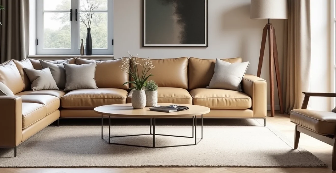
Furniture scale proportioning and Multi-Functional design
Successful small space furniture selection requires careful attention to scale, proportion, and functionality. The common misconception that smaller furniture automatically works better in small spaces often leads to cramped, ineffective layouts. Instead, the key lies in selecting appropriately scaled pieces that serve multiple functions whilst maintaining visual lightness through design elements such as exposed legs, glass surfaces, or streamlined profiles.
Multi-functional furniture represents the evolution of space-efficient design, moving beyond simple storage ottomans to sophisticated pieces that seamlessly integrate multiple uses. Modern modular systems allow for customisation based on daily needs, whilst transformative furniture can completely change room function throughout the day. Consider dining tables that convert to work desks, coffee tables with hidden storage compartments, or seating that doubles as storage solutions.
The psychological impact of furniture arrangement cannot be understated. Floating furniture – pieces raised on legs rather than sitting directly on the floor – creates visual flow underneath, making rooms appear larger. Similarly, transparent or translucent materials like glass and acrylic maintain function whilst minimising visual weight. These design principles work together to create spaces that feel open and uncluttered despite housing all necessary furnishings.
Scale relationships between furniture pieces significantly influence spatial perception. A single large sofa often works better than multiple smaller seating pieces, as it reduces visual clutter whilst providing equivalent seating capacity. The two-thirds rule suggests that your largest furniture piece should occupy approximately two-thirds of the wall it sits against, creating proper proportion that enhances rather than overwhelms the space.
Interior designers frequently employ the visual weight distribution principle, balancing heavy and light elements throughout the room to create equilibrium that supports spatial flow and functionality.
Vertical space optimisation through architectural elements
Maximising vertical space requires both practical storage solutions and visual techniques that draw the eye upward, creating the illusion of height. Architectural elements such as tall bookcases, floor-to-ceiling curtains, and vertical panelling systems effectively expand perceived room dimensions whilst providing functional benefits. The key lies in creating strong vertical lines that guide visual attention from floor to ceiling, emphasising height over width in compact spaces.
Built-in solutions offer the most effective approach to vertical optimisation, as custom installations maximise every available inch whilst maintaining clean, uncluttered aesthetics. Floor-to-ceiling storage systems, integrated lighting, and architectural details like crown moulding or decorative beams create sophisticated vertical emphasis that transforms ordinary rooms into visually striking spaces.
Layered lighting plays a crucial role in vertical space enhancement. Combining ambient, task, and accent lighting at different heights creates depth and dimension that supports the illusion of spaciousness. Wall sconces positioned at mid-height, pendant lights suspended from the ceiling, and uplighting that washes walls with light all contribute to vertical visual expansion.
The strategic use of artwork and decorative elements can reinforce vertical emphasis whilst adding personality to your space. Gallery walls arranged in vertical configurations, tall mirrors, and sculptural elements positioned at varying heights create visual rhythm that supports spatial perception. Consider the rule of thirds when positioning these elements, dividing wall height into three sections and placing focal points at the intersection lines for optimal visual impact.
Window treatment engineering for natural light maximisation
Window treatments significantly impact both natural light penetration and spatial perception in small rooms. Traditional heavy curtains and bulky blinds can dramatically reduce available light whilst creating visual barriers that fragment space. Modern window treatment approaches focus on maximising transparency whilst providing necessary privacy and light control functionality.
Sheer fabrics, lightweight linens, and innovative blind systems allow natural light to filter through whilst maintaining soft privacy screening. These materials create luminous boundaries rather than solid barriers, preserving the connection between interior and exterior spaces that’s crucial for spatial expansion. Motorised systems enable precise light control throughout the day without the visual bulk of traditional operating mechanisms.
The installation height and width of window treatments dramatically affects spatial perception. Mounting curtain rods or blind systems close to the ceiling and extending them beyond the window frame creates the illusion of larger windows whilst allowing maximum light penetration. This technique, known as window framing expansion , can make windows appear up to 25% larger than their actual dimensions.
Layered window treatment systems provide maximum flexibility whilst maintaining clean aesthetics. Combining translucent panels with blackout options allows for complete light control without sacrificing daytime brightness. These systems work particularly well in multipurpose spaces where lighting needs change throughout the day, such as studio apartments or combined living-sleeping areas.
Floor material selection and pattern psychology for spatial expansion
Flooring represents the foundation of spatial perception, influencing how we experience movement through and visual connection within compact spaces. Material selection, pattern orientation, and colour coordination with wall and ceiling treatments create either spatial continuity or visual fragmentation. Understanding these relationships enables you to make flooring choices that actively contribute to spatial expansion rather than limiting it.
Large format tiles, wide plank flooring, and continuous materials minimise visual breaks that can fragment small spaces. The fewer seams principle suggests that reducing the number of grout lines, board joints, or material transitions creates smoother visual flow that enhances perceived space. This approach works particularly well with light-coloured materials that reflect available light back into the room.
Pattern psychology plays a sophisticated role in spatial manipulation through flooring design. Diagonal installations create visual movement that can make rectangular rooms appear wider, whilst linear patterns running parallel to the longest wall emphasise room length. Herringbone and chevron patterns add textural interest without creating visual chaos, provided they’re executed in appropriate scale for the room dimensions.
The integration of flooring with wall treatments creates powerful spatial effects when properly coordinated. Continuing the same material from floor to lower wall sections, or selecting complementary tones that create subtle transition zones, eliminates harsh boundaries that can make spaces feel smaller. This technique works exceptionally well with natural materials like wood or stone that provide textural richness whilst maintaining colour harmony.
Contemporary designers often recommend the
70-20-10 colour distribution rulefor small spaces: 70% neutral base (walls, flooring), 20% secondary colour (furniture, large textiles), and 10% accent colour (accessories, artwork) to maintain visual balance whilst preventing overwhelming effects.