Seasonal shelf styling transforms your living spaces from static displays into dynamic expressions of the changing year. The art of refreshing your shelves throughout the seasons doesn’t require a complete overhaul or significant investment—strategic updates with carefully chosen elements can breathe new life into tired displays. Whether you’re working with built-in bookcases, floating shelves, or freestanding units, understanding how to incorporate seasonal elements effectively creates visual interest while maintaining the functional aspects of your storage solutions.
The psychology of seasonal decorating taps into our innate connection with nature’s rhythms, creating spaces that feel current and alive. Professional visual merchandisers have long understood that successful seasonal displays balance consistency with change, maintaining core design principles while introducing fresh colours, textures, and themes. This approach ensures your home feels welcoming and thoughtfully curated year-round, rather than appearing as though someone randomly scattered decorative objects across your shelves.
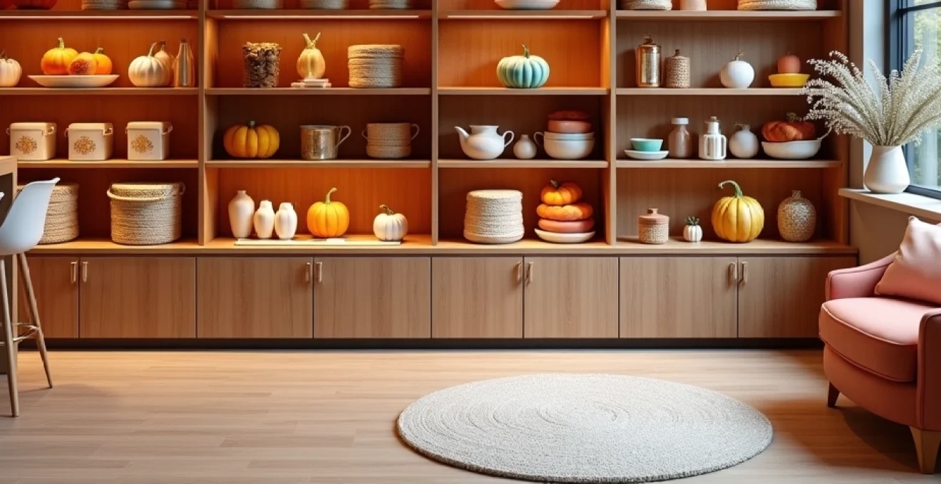
Autumn seasonal merchandising strategies for visual display
Autumn presents unique opportunities to create rich, layered displays that capture the season’s inherent warmth and abundance. The transition from summer’s bright lightness to autumn’s deeper sophistication requires thoughtful planning and execution. Professional stylists recommend beginning autumn updates in early September, allowing displays to evolve gradually rather than implementing dramatic overnight changes that can feel jarring or forced.
The foundation of successful autumn styling lies in understanding the season’s natural progression. Early autumn calls for subtle introductions of seasonal elements—perhaps a single amber glass vase or a small collection of brass candlesticks. As the season deepens, these initial touches can expand into more comprehensive displays featuring multiple textures, layers, and seasonal motifs. This gradual approach mirrors nature’s own timing and creates displays that feel organic rather than contrived.
Incorporating burnt orange and deep burgundy colour palettes
The autumn colour palette extends far beyond the obvious oranges and reds, encompassing a sophisticated range of hues that can complement existing décor. Burnt orange serves as an excellent bridge colour, working harmoniously with neutral backgrounds while providing enough warmth to signal seasonal change. Deep burgundy adds richness without overwhelming smaller displays, particularly when used as accent touches rather than dominant elements.
Consider incorporating these colours through varied mediums—ceramic vessels, fabric-bound books, dried botanicals, or small decorative objects. The key lies in distribution rather than concentration; scattered colour touches create visual flow across multiple shelf levels, while clustering similar hues can create unwanted focal points that disrupt overall balance. Professional visual merchandisers often use the 60-30-10 rule: 60% neutral tones, 30% seasonal colours, and 10% accent highlights.
Utilising natural textures through hessian and tweed materials
Texture plays a crucial role in autumn displays, adding tactile interest that invites closer examination. Hessian brings rustic charm without appearing too casual, particularly when used as wrapping for simple vases or as backing material for small framed artwork. The natural fibre’s loose weave creates visual texture that photographs beautifully and adds depth to displays when viewed from various angles.
Tweed introduces a more refined texture that bridges the gap between seasonal styling and year-round sophistication. Small tweed-covered boxes, picture frames, or decorative books can anchor autumn displays while maintaining enough neutrality to transition smoothly into winter themes. The key is selecting tweeds in muted colourways that complement rather than compete with other seasonal elements.
Implementing pumpkin and gourd seasonal props
Pumpkins and gourds offer versatility beyond their obvious decorative appeal, serving as both seasonal markers and functional design elements. Small white pumpkins provide clean, modern seasonal touches that work particularly well in minimalist or contemporary settings. Their neutral colour allows them to blend seamlessly with existing décor while still clearly signalling autumn’s arrival.
Gourds in varied shapes and sizes can create interesting sculptural groupings, particularly when arranged according to the rule of threes. Professional stylists often mix artificial and real elements, using high-quality artificial gourds in hard-to-reach areas while reserving fresh elements for eye-level displays where their natural variations can be appreciated. This approach extends display longevity while maintaining visual authenticity.
Strategic placement of amber LED lighting solutions
Lighting transforms autumn displays from static arrangements into living, breathing elements of your décor. Amber LED solutions provide the warm glow associated with autumn evenings while offering energy efficiency and safety benefits over traditional candles. Battery-operated LED fairy lights can be woven through displays, creating depth and highlighting specific elements without the fire hazards associated with open flames.
Consider the interplay between ambient lighting and display lighting when planning autumn shelves. Amber-toned LED spotlights can highlight specific seasonal vignettes, while string lights provide overall warmth. The key is layering different light sources to create depth and interest, much like professional window displays use multiple lighting techniques to draw attention and create atmosphere.
Winter holiday display transformation techniques
Winter holiday displays require careful balance between festive celebration and sophisticated design. The challenge lies in creating displays that capture holiday magic without appearing overly commercial or cluttered. Professional holiday merchandisers understand that successful winter displays often rely more on atmosphere and texture than on obvious seasonal symbols, creating spaces that feel celebratory without overwhelming the underlying room design.
The transition from autumn to winter styling should feel natural and evolutionary rather than abrupt. Many autumn elements can be repurposed or enhanced for winter displays—amber lighting becomes even more relevant during darker winter months, while rich textures provide necessary warmth during cold weather. The key is knowing which elements to retain, modify, or replace entirely as seasons change.
Winter displays benefit from a more refined approach to seasonal styling, emphasising quality over quantity and sophistication over obviousness. This approach ensures holiday displays enhance rather than dominate your living spaces, creating environments that feel celebratory but not temporary. The goal is achieving displays that you’ll want to maintain throughout the entire winter season, not just during specific holiday periods.
Metallic accent integration using copper and gold finishes
Metallic accents provide winter displays with necessary sparkle and sophistication while reflecting available light during darker months. Copper offers warmth that bridges autumn and winter themes, particularly when used in combination with evergreen elements or rich burgundy accents. The metal’s natural patina adds authenticity that artificial metallics often lack, creating displays with genuine character and depth.
Gold finishes require more careful integration to avoid appearing overly formal or commercial. Brushed gold or antique gold finishes work better than bright, shiny alternatives for residential displays. Small gold accents—picture frames, candlesticks, or decorative objects—can be scattered throughout displays to create cohesion without overwhelming individual shelf arrangements. The key is maintaining restraint while ensuring adequate distribution for visual balance.
Evergreen garland and pine cone styling elements
Evergreen elements bring life and freshness to winter displays while providing the natural textures that indoor spaces crave during cold months. Fresh evergreen garland offers superior fragrance and appearance but requires more maintenance than artificial alternatives. High-quality artificial evergreen can provide similar visual impact while lasting throughout the season, particularly when enhanced with fresh elements like pine cones or small branches.
Pine cones serve as excellent transitional elements, working equally well in autumn and winter displays. Their natural variations in size and colour prevent displays from appearing too uniform or staged. Professional stylists often enhance natural pine cones with light dustings of artificial snow or metallic spray, but these treatments should be applied sparingly to maintain authenticity while adding seasonal interest.
Frosted glass and crystal ornament arrangements
Frosted glass elements capture and reflect winter light beautifully, creating displays that sparkle without appearing overly festive. Simple frosted glass vessels, candleholders, or decorative spheres provide winter interest while maintaining enough neutrality to work with various décor styles. The key is selecting pieces with interesting shapes or textures that create visual interest beyond their surface finish.
Crystal ornaments require careful selection to avoid appearing too obviously holiday-focused. Clear crystal pieces with interesting cuts or shapes can remain in displays throughout winter, while coloured crystal should be chosen to complement existing room colours rather than traditional holiday palettes. The reflective qualities of crystal elements help maximise available winter light, creating brighter, more welcoming displays during darker months.
Fairy light installation methods for enhanced visual appeal
Fairy lights have evolved beyond simple string applications, offering sophisticated lighting solutions for winter displays. Warm white LEDs provide gentle illumination that enhances rather than overwhelms display elements. Battery-operated options offer installation flexibility without visible cords, while timer functions ensure displays remain lit during optimal viewing hours without constant manual management.
Professional installation techniques include weaving lights through display elements rather than simply draping them over surfaces. This creates depth and ensures even light distribution throughout the display. Consider the colour temperature of LED lights carefully—warm white (2700K-3000K) provides cosy, intimate lighting that complements winter displays, while cool white can appear harsh and clinical in residential settings.
Spring refresh merchandising approaches
Spring styling represents the most dramatic seasonal transition, requiring careful orchestration to avoid jarring contrasts with winter’s remaining elements. The psychological impact of spring displays cannot be understated—after months of darker, heavier winter themes, the introduction of fresh colours and lighter textures provides genuine mood enhancement that extends throughout the home. Professional stylists approach spring transitions gradually, beginning with subtle colour introductions in February and building toward full spring displays by March.
The challenge of spring styling lies in capturing the season’s energy without creating displays that feel temporary or superficial. Successful spring displays balance freshness with sophistication, incorporating seasonal elements that enhance rather than dominate existing décor. This requires understanding which winter elements can transition smoothly into spring themes and which require complete replacement for optimal visual impact.
Spring displays benefit from increased attention to negative space and visual lightness. After winter’s necessarily dense and warm arrangements, spring calls for more breathing room between elements and greater emphasis on vertical displays that draw the eye upward. The goal is creating displays that feel as fresh and optimistic as the season itself, providing visual relief after winter’s intensity while maintaining the sophistication that makes displays appropriate for adult living spaces.
Consider the natural progression of spring itself when planning display updates. Early spring elements might include forced branches, pale green accents, and clean white ceramics. As the season progresses, these can be joined by fresh flowers, brighter greens, and more obviously seasonal elements like bird’s nests or small potted plants. This gradual evolution mirrors nature’s own timing and prevents displays from appearing forced or premature.
The colour palette for spring displays extends far beyond predictable pastels, encompassing fresh whites, sage greens, soft yellows, and even subtle coral tones. The key is selecting colours that feel fresh without appearing juvenile, creating displays that capture spring’s optimism while maintaining adult sophistication. Professional merchandisers often anchor spring displays with plenty of white or cream elements, using colour as accent rather than foundation for overall visual success.
Summer coastal and botanical display themes
Summer styling embraces both coastal influences and botanical abundance, creating displays that capture the season’s relaxed sophistication and natural beauty. The coastal aesthetic extends beyond obvious beach elements, incorporating the clean lines, natural textures, and weathered finishes that characterise seaside living. This approach works particularly well in contemporary settings where obvious seasonal symbols might feel out of place, providing subtle seasonal acknowledgment without compromising design integrity.
Botanical themes for summer displays celebrate the abundance of the growing season while bringing necessary life and colour into indoor spaces. The key is selecting botanical elements that complement rather than compete with existing décor, creating displays that feel abundant without appearing cluttered. Fresh flowers provide immediate impact but require regular maintenance, while high-quality artificial alternatives can provide lasting beauty with minimal upkeep requirements.
Nautical rope and driftwood styling components
Nautical rope adds textural interest and casual sophistication to summer displays without requiring obvious coastal symbols. Natural fibre ropes in neutral colours work particularly well, providing organic texture that complements both contemporary and traditional settings. Professional stylists often use rope as wrapping for simple vases or as casual “ties” for grouped elements, creating cohesive displays that feel effortlessly assembled rather than formally arranged.
Driftwood pieces serve as excellent sculptural elements, providing organic shapes that contrast beautifully with geometric display surfaces. The key is selecting pieces with interesting forms rather than obvious “beach” associations, creating displays that capture coastal character without appearing theme-heavy. Driftwood’s natural weathering provides textural interest that photographs beautifully and creates visual depth when combined with smoother elements like glass or ceramic pieces.
Seagrass basket and rattan furniture integration
Seagrass baskets provide practical storage solutions while contributing to summer’s relaxed aesthetic. Their natural variations in weave and colour prevent displays from appearing too uniform, while their organic origins complement the botanical elements often featured in summer arrangements. Baskets work particularly well for concealing less attractive but necessary items, maintaining visual cleanliness while providing functional storage solutions.
Rattan elements bring tropical sophistication to summer displays, whether through small decorative objects, picture frames, or accent furniture pieces. The material’s natural warmth and organic texture complement summer’s emphasis on natural materials while providing enough structure to anchor more casual display elements. Quality rattan pieces can transition successfully between seasons when paired with appropriate accent colours and textures.
Fresh eucalyptus and lavender natural elements
Eucalyptus provides excellent foliage for summer displays, offering silvery-green colour that complements various décor styles while providing subtle fragrance that enhances the sensory experience of styled spaces. Fresh eucalyptus lasts considerably longer than most cut flowers, providing weeks of beauty with minimal maintenance. The foliage’s natural movement adds organic flow to structured displays while its muted colour prevents it from overwhelming other display elements.
Lavender introduces both colour and fragrance to summer displays, creating multisensory experiences that capture the season’s garden abundance. Dried lavender offers superior longevity compared to fresh alternatives while maintaining much of its natural fragrance and colour. Professional arrangers often combine lavender with white or cream elements to prevent purple tones from appearing too dominant or overwhelming in residential settings.
Coral and turquoise accent colour implementation
Coral provides vibrant summer colour without the harshness of pure orange or red tones. The colour works particularly well in small doses—perhaps through ceramic vessels, picture matting, or fabric accents—where it can provide visual interest without dominating display arrangements. Coral’s warmth complements the cooler tones often featured in summer displays, creating balanced arrangements that feel both energetic and sophisticated.
Turquoise offers cooling relief during summer months while providing the colour impact that summer displays often require. The key is selecting turquoise elements with enough subtlety to work with existing colour schemes rather than demanding complete colour coordination. Glass elements in turquoise tones work particularly well, as their transparency prevents them from appearing too solid or overwhelming within mixed-element displays.
Transitional styling methodologies between seasons
The art of seasonal transitions requires understanding which elements can bridge multiple seasons and which require complete replacement for optimal visual impact. Professional stylists approach transitions strategically, identifying “anchor” pieces that remain constant while supporting elements change seasonally. This approach ensures display continuity while allowing for seasonal evolution, creating spaces that feel thoughtfully curated rather than constantly changing.
Successful transitions often involve colour evolution rather than complete replacement. Autumn’s deep burgundies might gradually shift toward winter’s forest greens, which then evolve into spring’s sage tones and finally summer’s brighter botanical colours. This gradual progression feels natural and prevents the visual shock that can result from dramatic seasonal overhauls implemented too quickly or without consideration for existing elements.
The timing of seasonal transitions requires sensitivity to both calendar dates and local climate conditions. Early transitions can feel premature and forced, while delayed changes might miss opportunities to enhance mood during transitional periods when seasonal support feels most beneficial. Professional merchandisers often begin seasonal transitions 2-3 weeks before peak seasonal periods, allowing displays to evolve gradually rather than changing overnight.
Storage considerations play crucial roles in transition planning. Successful seasonal styling requires organised storage systems that protect off-season elements while keeping them easily accessible for future use. Investment in proper storage containers, labelling systems, and climate-controlled storage spaces pays dividends in maintained display quality and efficient seasonal transitions year after year.
Cost-effective inventory management for seasonal displays
Professional seasonal styling doesn’t require extensive financial investment when approached strategically. The key lies in selecting versatile pieces that work across multiple seasons while investing in fewer, higher-quality items rather than numerous disposable decorations. This approach creates more sophisticated displays while reducing long-term costs and storage requirements that can make seasonal styling impractical for smaller living spaces.
Building a curated inventory of seasonal elements requires strategic thinking about storage, durability, and versatility. Focus on acquiring pieces that can serve multiple functions—ceramic vessels that work for both autumn gourds and spring flowers, neutral baskets that complement various seasonal themes, and lighting solutions that enhance displays regardless of seasonal content. This multipurpose approach maximises investment value while minimising storage requirements.
Quality over quantity remains the fundamental principle of cost-effective seasonal styling. A single, well-crafted ceramic vase will provide years of seasonal service across multiple display themes, while numerous inexpensive alternatives may require frequent replacement and ultimately cost more over time. Professional visual merchandisers often invest 70% of their seasonal budgets in foundational pieces that anchor displays year after year, reserving only 30% for truly seasonal elements that change regularly.
Consider developing relationships with local artisans, farmers’ markets, or seasonal suppliers who can provide natural elements at reasonable costs. Many professional stylists source branches, pine cones, and seasonal foliage directly from landscapers or tree services, obtaining fresh materials at fraction of retail costs. This approach also ensures access to locally appropriate seasonal elements that feel authentic to your regional environment rather than generic seasonal decorations that could apply anywhere.
Timing purchases strategically can result in significant savings on seasonal inventory. Post-season clearances often offer 50-70% discounts on quality seasonal elements, allowing you to build inventory for future years at substantial savings. The key is purchasing classic, versatile pieces rather than trend-driven items that may feel dated by the time you use them. Neutral metallics, natural textures, and quality artificial botanicals represent excellent clearance investments that provide long-term styling value.
DIY elements can significantly reduce costs while adding personal character to seasonal displays. Simple techniques like spray-painting pine cones, creating custom garlands from natural materials, or crafting seasonal arrangements from garden clippings provide unique display elements at minimal cost. The handcrafted quality often exceeds mass-produced alternatives while ensuring your displays have distinctive character that reflects your personal aesthetic rather than generic seasonal themes.
Storage solutions deserve investment equal to display elements themselves. Proper storage containers, climate control, and organisation systems protect seasonal investments while ensuring easy access for efficient transitions. Professional-grade storage solutions—acid-free boxes, moisture-absorbing packets, and careful labelling systems—extend the life of seasonal elements significantly, making higher initial investments in quality pieces economically sensible over time. Consider storage costs as part of overall seasonal styling budgets to ensure long-term success and sustainability of your seasonal display programme.