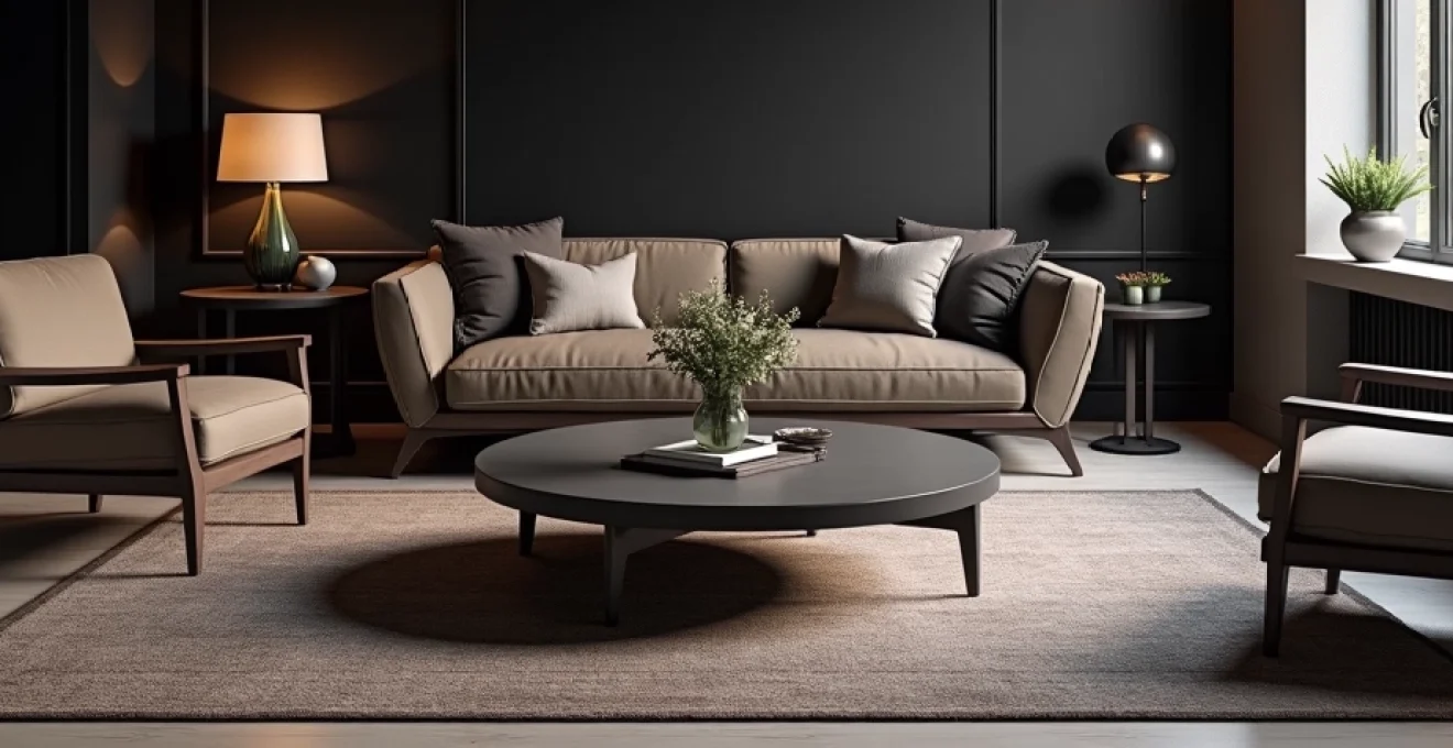
The interplay between light and shadow has captivated artists and designers for centuries, yet in contemporary interior design, this fundamental principle often takes a backseat to trend-driven colour palettes. Chiaroscuro , the Italian term describing the dramatic contrast between light and dark elements, offers interior designers an unparalleled tool for creating spaces that transcend mere aesthetics to become emotionally resonant environments. When applied thoughtfully to residential and commercial interiors, these contrasting elements can manipulate spatial perception, enhance architectural features, and establish powerful atmospheric narratives that deeply influence how occupants experience and interact with their surroundings.
Fundamental principles of chiaroscuro in contemporary interior design
The application of dramatic light-dark contrasts in interior spaces operates on multiple sensory and psychological levels. Understanding these foundational principles enables designers to craft environments that achieve both visual impact and functional excellence. Modern interior design increasingly embraces bold contrasts as homeowners seek spaces that reflect personality whilst maintaining sophistication.
Luminance ratios and visual hierarchy in spatial planning
Effective contrast manipulation begins with understanding luminance ratios—the mathematical relationship between light and dark surfaces within a given space. Professional designers typically aim for luminance ratios between 3:1 and 10:1 to create compelling visual hierarchies without causing eye strain. These ratios determine which architectural elements receive primary attention and how the human eye naturally navigates through interior spaces. When planning dramatic contrasts, consider that surfaces reflecting 80% of available light will appear brilliant white, whilst those reflecting merely 5% will read as deep black under identical lighting conditions.
Strategic positioning of contrasting elements guides occupant movement patterns and establishes focal points within rooms. Dark accent walls positioned perpendicular to primary light sources create natural gathering areas, whilst lighter surfaces parallel to windows amplify available daylight throughout the space. This calculated approach to luminance distribution transforms ordinary rooms into carefully choreographed experiences.
Tonal contrast theory applied to architectural elements
Architectural features gain prominence through thoughtful tonal contrast application. Crown moulding painted in deep charcoal against cream walls creates striking definition, whilst light-coloured ceiling treatments visually elevate room height when paired with darker wall colours. This technique proves particularly effective in period properties where original architectural details deserve emphasis.
Modern minimalist interiors benefit from subtle tonal variations that maintain clean aesthetics whilst preventing sterility. Consider how mid-tone grey cabinetry against brilliant white walls provides sufficient contrast to define kitchen zones without overwhelming the space. These measured approaches demonstrate that dramatic contrast need not sacrifice contemporary design principles.
Psychological impact of Light-Dark dichotomy on spatial perception
The psychological effects of contrasting interiors extend far beyond mere visual appeal. Research in environmental psychology indicates that spaces featuring dramatic light-dark contrasts can reduce stress levels by up to 25% compared to monotonous colour schemes. Dark environments naturally encourage introspection and relaxation, making them ideal for bedrooms and meditation spaces, whilst brighter contrast zones promote alertness and social interaction.
Cultural associations also influence how occupants respond to contrasting schemes. Western design traditions often associate dark colours with luxury and sophistication, explaining why high-end hotels and restaurants frequently employ dramatic contrast techniques. Understanding these psychological triggers enables designers to create spaces that not only look impressive but actively enhance occupant wellbeing and behaviour patterns.
Material reflectance values and surface interaction dynamics
Material selection significantly impacts the success of contrast-based design schemes. Surfaces with varying reflectance values interact differently with ambient and artificial lighting, creating complex visual relationships that evolve throughout the day. Matte finishes absorb more light than their glossy counterparts, making them ideal for creating true dark zones within interiors, whilst metallic accents can bridge the gap between light and dark areas through their reflective properties.
Natural materials introduce additional complexity to contrast calculations. Rough-hewn timber absorbs more light than polished hardwood, whilst natural stone varieties exhibit unique reflectance patterns based on their mineral composition. These material characteristics must be carefully considered when developing contrast-heavy design schemes to ensure consistent visual impact across varying lighting conditions.
Strategic lighting design techniques for dramatic spatial effects
Lighting design forms the cornerstone of successful contrast-based interiors. Without strategic illumination planning, even the most thoughtfully selected colour palettes can appear flat and unengaging. Contemporary lighting technology offers unprecedented control over how contrasts appear and evolve throughout different times of day and seasonal changes.
Directional accent lighting with philips hue and LIFX systems
Smart lighting systems revolutionise how designers approach contrast manipulation. Philips Hue and LIFX technologies enable precise colour temperature adjustment from warm 2700K to cool 6500K, dramatically altering how contrasting surfaces interact visually. Warm temperatures enhance the cosiness of dark materials, whilst cooler light makes bright surfaces appear more expansive and energising.
Directional accent lighting creates dramatic shadow patterns that emphasise architectural features and artwork. Position smart spotlights at 30-degree angles to highlighted surfaces to achieve optimal contrast without creating harsh shadows. These systems also enable seasonal adjustments—warmer temperatures during winter months enhance the psychological comfort of dark interiors, whilst cooler summer settings prevent spaces from feeling oppressive.
Shadow architecture through recessed LED strip implementation
Recessed LED strips offer subtle yet powerful contrast enhancement opportunities. Installing strips within ceiling coves creates ambient uplighting that softens stark contrasts whilst maintaining dramatic impact. Similarly, under-cabinet lighting in kitchens featuring dark upper cabinets against light walls provides functional task lighting whilst emphasising the tonal relationship between surfaces.
Shadow architecture —the deliberate creation of shadow patterns through strategic lighting placement—adds depth and visual interest to contrast-heavy spaces. LED strips concealed behind floating shelves or within wall niches create layers of light and shadow that enhance the three-dimensional quality of interior spaces. This technique proves particularly effective in minimalist interiors where furniture pieces are sparse.
Layered illumination schemes using pendant and track configurations
Professional lighting designers employ layered illumination strategies combining ambient, task, and accent lighting to create compelling contrast scenarios. Track lighting systems offer exceptional flexibility for highlighting specific contrasting elements whilst pendant fixtures provide focused illumination pools that enhance intimate seating areas within larger contrast-heavy spaces.
The key to successful layered lighting lies in avoiding uniform illumination levels throughout the space. Vary light intensities between 100 lux for ambient areas and 300 lux for task zones to create natural contrast hierarchies. This approach ensures that dramatic colour contrasts remain visible and impactful regardless of the primary lighting scenario being employed.
Smart dimming controls for dynamic contrast modulation
Advanced dimming systems enable dynamic contrast adjustment throughout daily activity cycles. Morning brightness levels can emphasise light elements to promote alertness, whilst evening settings can enhance darker tones to encourage relaxation. Lutron and Control4 systems offer pre-programmed scenes that automatically adjust multiple light sources to maintain optimal contrast relationships.
Consider installing separate dimming circuits for lights illuminating contrasting surfaces. This enables independent control over how light and dark elements appear relative to each other, providing unprecedented flexibility in managing the emotional tone of spaces throughout different usage periods.
Dark palette material selection and application methods
The selection and application of dark materials requires careful consideration of both aesthetic impact and practical performance. Dark surfaces absorb more heat and show dust more readily than lighter alternatives, yet when properly specified and maintained, they create unparalleled sophistication and visual drama within interior spaces.
Charcoal benjamin moore HC-166 and farrow & ball Off-Black integration
Benjamin Moore HC-166 Kendall Charcoal represents the gold standard for sophisticated dark wall treatments. This carefully formulated colour maintains depth without appearing flat or lifeless under various lighting conditions. Its slight blue undertones prevent the muddy appearance that affects many dark paints, whilst its advanced pigmentation ensures consistent coverage across large wall surfaces.
Farrow & Ball Off-Black No. 57 offers a more nuanced approach to dark colour application. This complex formulation includes subtle green undertones that create visual warmth whilst maintaining the sophisticated impact of true dark colours. When paired with crisp white architectural trim, these premium paint selections create stunning contrast relationships that enhance rather than diminish spatial perception.
The secret to successful dark colour application lies not in the darkness itself, but in the quality of the pigmentation and the precision of the application technique.
Matte finish techniques for light absorption maximisation
Matte finishes maximise light absorption whilst creating sophisticated surface textures that enhance the visual depth of dark colours. Modern matte formulations offer improved durability compared to historical versions, making them suitable for high-traffic areas where dramatic impact is desired. Application technique significantly affects the final appearance—use high-quality synthetic brushes or premium rollers with 3/8-inch nap to achieve uniform coverage.
Primer selection becomes critical when applying dark matte finishes. Grey-tinted primers reduce the number of topcoats required whilst ensuring consistent colour development across the entire surface. This attention to preparation details ensures that dark surfaces maintain their intended visual impact for years rather than appearing patchy or faded.
Textural contrast through velvet, leather, and raw steel elements
Material textures amplify the impact of light-dark contrasts through their unique light-absorbing and reflecting properties. Velvet upholstery in deep navy or charcoal colours creates luxurious focal points that absorb light completely, whilst polished leather surfaces provide subtle reflectance that bridges the gap between matte and glossy finishes.
Raw steel elements introduce industrial sophistication whilst offering unique patination opportunities. Weathering steel develops rich rust tones that complement both light and dark colour palettes, whilst blackened steel maintains consistent dark tones with subtle reflective properties. These materials age gracefully, developing character that enhances rather than diminishes their visual impact over time.
Deep hue saturation in cabinetry and built-in millwork
Kitchen and bathroom cabinetry finished in deeply saturated colours creates dramatic focal points whilst providing practical storage solutions. Forest green cabinetry paired with white quartz countertops exemplifies how contrasting elements can enhance both aesthetic appeal and functional clarity. The dark surfaces hide fingerprints and minor scratches better than lighter alternatives, whilst the contrasting counters provide clear work surface definition.
Built-in millwork offers exceptional opportunities for contrast implementation. Floor-to-ceiling bookcases in deep colours create sophisticated backdrops for lighter furnishings, whilst window seats upholstered in contrasting fabrics become natural focal points within larger rooms. These permanent installations establish the contrast foundation upon which furniture and accessories can build additional visual interest.
Architectural case studies: successful Light-Dark interior implementations
Examining successful contrast implementations across various architectural styles reveals common principles that transcend specific design trends. Contemporary residential projects increasingly feature bold contrast statements that create memorable spatial experiences whilst maintaining livability and functionality.
The renovation of a Victorian terraced house in London demonstrates how historical architecture benefits from contemporary contrast applications. The original architectural details were emphasised through strategic dark colour placement—deep blue walls in the dining room create intimate evening atmosphere, whilst white ceiling treatments maintain the room’s generous proportions. Crown moulding painted to match the walls creates seamless transitions that enhance rather than interrupt the architectural flow.
Modern loft conversions showcase how industrial architectural elements gain prominence through contrast techniques. Exposed brick walls painted in deep charcoal provide dramatic backdrops for contemporary furniture, whilst white-painted steel beams create striking linear elements against dark surfaces. These applications demonstrate how contrast enhances rather than competes with existing architectural character.
Scandinavian design traditions incorporate contrast through natural material combinations rather than painted surfaces. Light oak flooring paired with dark-stained timber panelling creates sophisticated tonal relationships that feel both contemporary and timeless. These approaches prove that dramatic contrast need not rely solely on paint colour selections but can emerge from thoughtful material combinations.
Restaurant and hospitality interiors provide compelling examples of contrast used to enhance specific atmospheric goals. Dark dining rooms with strategically positioned accent lighting create intimate environments that encourage extended stays, whilst bright bar areas with dark accent walls provide energising social spaces. These commercial applications demonstrate how contrast directly influences occupant behaviour and experience quality.
Advanced colour temperature manipulation for atmospheric control
Colour temperature manipulation represents one of the most sophisticated tools available for enhancing contrast-based interior design schemes. The relationship between artificial light colour temperatures and surface colours creates complex visual interactions that can dramatically alter how contrasting elements appear and feel throughout different times of day and seasonal cycles.
Research conducted by the Lighting Research Center indicates that colour temperature variations of just 500K can alter perceived contrast ratios by up to 15%. This sensitivity enables designers to fine-tune atmospheric effects through precise lighting specifications. Warm colour temperatures (2700K-3000K) enhance the richness of dark surfaces whilst making light elements appear softer and more inviting. Conversely, cool temperatures (4000K-5000K) sharpen contrasts and create more dramatic visual separation between light and dark elements.
Circadian lighting systems automatically adjust colour temperatures throughout daily cycles, ensuring that contrast relationships remain optimal for occupant wellbeing. Morning settings emphasise cooler temperatures that enhance light surfaces and promote alertness, whilst evening programs shift toward warmer temperatures that make dark elements feel more enveloping and relaxing. These automated systems represent the future of responsive interior design, where spaces adapt to human biological rhythms whilst maintaining aesthetic excellence.
The most successful contrast-heavy interiors are those that feel different at various times of day, creating dynamic environments that respond to human activity patterns and emotional needs.
Seasonal colour temperature adjustments become particularly important in regions with significant daylight variation throughout the year. Winter months benefit from warmer artificial lighting that complements shorter daylight hours, whilst summer settings can employ cooler temperatures that enhance the perceived freshness of air-conditioned interior spaces. These considerations ensure that dramatic contrast schemes remain comfortable and inviting regardless of external conditions.
Task-specific colour temperature zoning enables optimal functionality within contrast-heavy spaces. Reading areas benefit from neutral 3500K lighting that provides accurate colour rendition without compromising the surrounding contrast scheme, whilst food preparation zones require cooler 4000K illumination for safety and precision. This layered approach ensures that dramatic aesthetics never compromise practical requirements.
Professional tools and software for Contrast-Based design planning
Contemporary design professionals rely on sophisticated software tools to predict and refine contrast relationships before implementation begins. These technological resources enable precise contrast calculations whilst reducing the risk of expensive mistakes during construction phases.
DIALux evo lighting simulation software enables designers to model how different colour temperatures and lighting configurations will affect contrast relationships within specific architectural spaces. This professional-grade tool accounts for material reflectance values, daylight contributions, and artificial lighting specifications to create accurate visualisations of proposed contrast schemes. The software’s photorealistic rendering capabilities help clients understand complex design proposals whilst enabling designers to refine their approaches before committing to specific material selections.
Colour matching technologies such as the X-Rite ColorMunki system ensure consistent colour relationships across different materials and lighting conditions. These tools become particularly valuable when specifying custom paint colours or matching existing architectural elements. Professional colour measurement eliminates guesswork and ensures that intended contrast relationships translate accurately from design concepts to finished installations.
Virtual reality design tools increasingly enable clients to experience proposed contrast schemes before construction begins. Enscape and Twinmotion platforms create immersive environments where contrast relationships can be evaluated under various lighting conditions and times of day. This technology proves particularly valuable for high-stakes commercial projects where contrast decisions affect brand identity and customer experience quality.
| Design Software | Primary Function | Contrast Analysis Features | Professional Use Level |
|---|---|---|---|
| DIALux evo | Lighting simulation | Luminance ratio calculation | Advanced |
| SketchUp + V-Ray | 3D modelling + rendering | Material reflectance visualisation | Intermediate to Advanced |
| AutoCAD Architecture | Technical drawing | Precise measurement tools | Professional |
| Adobe Color | Colour palette creation | Contrast ratio testing |
Project management platforms increasingly incorporate contrast analysis features that streamline collaboration between designers, contractors, and clients. Monday.com and Asana project templates specifically designed for interior design projects include contrast review checkpoints and material approval workflows. These tools ensure that complex contrast schemes remain coordinated throughout extended project timelines whilst maintaining clear communication between all stakeholders.
Mobile applications such as Pantone Studio and Adobe Capture enable on-site colour matching and contrast evaluation during construction phases. These tools prove invaluable when making real-time adjustments to contrast schemes based on actual lighting conditions and material installations. The ability to capture and analyse colours directly from job sites eliminates discrepancies between design intentions and final results.
Artificial intelligence-powered design tools are beginning to offer predictive contrast analysis that suggests optimal colour relationships based on room dimensions, lighting conditions, and intended usage patterns. While still in early development stages, these emerging technologies promise to revolutionise how designers approach contrast planning by providing data-driven recommendations that account for human psychological responses and practical maintenance considerations.
The integration of building information modelling (BIM) software with contrast analysis tools enables comprehensive project coordination where lighting, materials, and architectural elements work together to achieve intended design goals. This holistic approach ensures that dramatic contrast schemes enhance rather than compromise building performance and occupant comfort throughout the structure’s operational lifetime.
The future of contrast-based design lies not in intuition alone, but in the intelligent combination of creative vision with precise technological analysis that ensures every design decision contributes to both aesthetic excellence and functional performance.
As technology continues to evolve, the tools available for planning and implementing dramatic contrast schemes will become increasingly sophisticated. However, the fundamental principles of light-dark relationships and their psychological impacts remain constant, requiring designers to balance technological capabilities with timeless design wisdom to create spaces that truly enhance human experience and wellbeing.