The arrangement of elements within your living space speaks volumes about your design sensibilities and can profoundly impact how you and your guests experience the environment. Interior design professionals have long understood that the strategic use of symmetry and asymmetry serves as the invisible framework that transforms a collection of furniture and accessories into a cohesive, emotionally resonant home. These fundamental design principles work together to create visual harmony, guide the eye through space, and establish the overall character of your rooms.
Modern homeowners increasingly seek spaces that feel both intentional and lived-in, perfectly balanced yet authentically personal. This delicate equilibrium emerges from understanding how symmetrical arrangements provide stability and calm, while asymmetrical compositions inject energy and personality into your décor. Whether you’re redesigning a single room or planning an entire home renovation, mastering these complementary approaches will elevate your interior design from merely functional to genuinely inspiring.
Understanding visual weight distribution in interior design principles
Visual weight forms the foundation of successful interior compositions, determining how elements within a room capture attention and create balance. Every object in your space possesses inherent visual weight based on its size, colour intensity, texture complexity, and positioning relative to other elements. Dark colours naturally feel heavier than light ones, whilst rough textures command more attention than smooth surfaces. Understanding these relationships allows you to manipulate the visual equilibrium of your rooms with precision and confidence.
The concept extends beyond individual objects to encompass entire room compositions. A single oversized artwork can balance multiple smaller pieces, while a bold accent colour strategically placed across from neutral tones creates dynamic tension. Professional designers leverage these principles to create rooms that feel naturally balanced, even when elements differ dramatically in scale or style. The key lies in recognising that visual weight operates independently from physical weight – a small, vibrant red cushion can counterbalance a large, pale sofa when positioned thoughtfully.
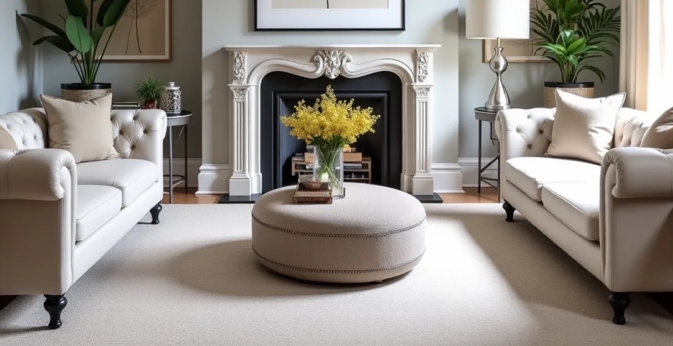
Bilateral symmetry applications in traditional georgian and victorian homes
Georgian and Victorian architecture naturally lends itself to bilateral symmetry, with their characteristic central doorways, evenly spaced windows, and formal room proportions. In these traditional homes, symmetrical arrangements honour the architectural heritage whilst creating spaces that feel dignified and timeless. Consider flanking a Georgian fireplace with identical wingback chairs upholstered in matching fabrics, each accompanied by identical side tables and table lamps. This classical approach reinforces the room’s inherent formality whilst providing practical seating arrangements that encourage conversation.
Victorian homes benefit from symmetrical treatments that acknowledge their ornate architectural details without competing for attention. Matching bookcases on either side of a bay window, identical console tables beneath twin mirrors, or paired settees facing each other across a Persian rug all honour the period’s love of balanced compositions. The key is selecting pieces that echo the home’s architectural grandeur whilst maintaining the structured elegance that defines these historical styles.
Radial symmetry techniques for circular room layouts and rotundas
Circular rooms and rotundas present unique design opportunities that call for radial symmetry approaches. Unlike bilateral arrangements, radial symmetry radiates outward from a central focal point, creating compositions that feel naturally harmonious with curved architectural elements. In a circular dining room, consider positioning chairs equidistantly around a round table, with matching wall sconces placed at regular intervals to reinforce the room’s geometric harmony.
Rotundas and curved spaces benefit from furniture arrangements that follow the room’s natural flow. Curved sectional seating that echoes the wall’s curvature, combined with a central coffee table and evenly spaced floor lamps, creates a sense of unity between architecture and furnishings. The challenge lies in maintaining the radial balance whilst accommodating practical needs like traffic flow and natural lighting considerations.
Asymmetrical balance through the rule of thirds in contemporary spaces
The rule of thirds, borrowed from photography and fine arts, provides a reliable framework for creating compelling asymmetrical arrangements in contemporary interiors. This principle divides spaces into nine equal sections using two horizontal and two vertical lines, with focal points positioned at the intersections for maximum visual impact. In modern living spaces, this might translate to positioning a statement sofa one-third of the way across a room rather than centring it, creating negative space that enhances the overall composition.
Contemporary homes particularly benefit from asymmetrical approaches that reflect modern life’s informal nature. An off-centre gallery wall balanced by a substantial floor lamp, or a kitchen island positioned asymmetrically within the space whilst maintaining functional workflow, demonstrates how the rule of thirds creates visual interest without sacrificing practicality. These arrangements feel fresh and dynamic, perfectly suited to today’s casual living preferences.
Dynamic equilibrium methods using focal point hierarchy
Creating dynamic equilibrium requires establishing a clear hierarchy of focal points that guide the eye through your space in a deliberate sequence. The primary focal point – perhaps a statement fireplace or dramatic artwork – anchors the room, whilst secondary elements provide supporting interest without overwhelming the main attraction. This hierarchy prevents visual chaos whilst maintaining the energy that makes asymmetrical arrangements compelling.
Successful focal point hierarchy often employs the triangle principle, where three points of visual interest create a stable yet dynamic composition. In a living room, this might involve a primary artwork above the sofa, a substantial table lamp in one corner, and an architectural element like a built-in bookshelf on the opposite wall. The eye naturally moves between these points, creating a sense of movement and discovery that keeps the space engaging over time.
Symmetrical design implementation across different room functions
Symmetrical design principles adapt beautifully to various room functions, each requiring specific considerations to maximise both aesthetic appeal and practical utility. The key lies in understanding how symmetry serves the unique needs of different spaces whilst maintaining visual coherence throughout your home. From formal entertaining areas to private retreats, symmetrical arrangements provide structure and elegance that enhances the room’s intended purpose.
Formal living room arrangements with matching chesterfield sofas
Formal living rooms benefit enormously from symmetrical arrangements that convey sophistication and encourage structured social interaction. Matching Chesterfield sofas positioned facing each other across a substantial coffee table create an inviting conversation area that feels both elegant and purposeful. This classic arrangement works particularly well in homes with traditional architectural details, where the formal symmetry complements period features like crown moulding and decorative fireplaces.
To enhance this symmetrical foundation, consider adding identical side tables with matching table lamps at each sofa’s ends, ensuring adequate task lighting for reading whilst maintaining the balanced composition. The space between the sofas should accommodate comfortable conversation whilst allowing easy movement around the seating arrangement. Floor treatments play a crucial role – a carefully sized area rug that extends equally under both sofas helps unify the arrangement whilst defining the conversation zone.
Master bedroom symmetry using identical bedside tables and table lamps
Master bedrooms naturally lend themselves to symmetrical treatments that promote rest and relaxation through visual balance. Identical bedside tables flanking the bed provide both practical storage and aesthetic harmony, particularly when topped with matching table lamps that ensure equal task lighting on both sides. This arrangement feels inherently restful because it eliminates visual tension, allowing the mind to settle more easily at day’s end.
The symmetrical approach extends beyond bedside arrangements to include window treatments, where matching curtain panels or blinds frame views whilst maintaining the room’s balanced character. Consider positioning identical armchairs or a bench at the foot of the bed to create a secondary seating area that reinforces the room’s symmetrical foundation. The key is selecting pieces that complement the bed’s scale whilst providing practical function for daily routines.
Dining room balance with coordinated windsor chair placement
Dining rooms function best when furniture arrangements facilitate comfortable dining and easy service, making symmetrical chair placement both practical and visually pleasing. Windsor chairs arranged in pairs along a rectangular table’s long sides create natural balance whilst allowing diners to face each other comfortably. The chairs’ consistent spacing ensures adequate elbow room whilst maintaining the geometric harmony that makes formal dining feel special.
Extending the symmetrical principle to other dining room elements enhances the overall composition. Consider positioning identical buffet lamps at either end of a sideboard, or flanking the room’s entrance with matching console tables topped with seasonal displays. Ceiling treatments like evenly spaced pendant lights above the table reinforce the symmetrical foundation whilst providing practical task lighting for dining activities. The goal is creating an environment that feels both celebratory and organised.
Bathroom mirror symmetry in double vanity configurations
Double vanity bathrooms require careful symmetrical planning to ensure both partners enjoy equal access to storage, lighting, and mirror space. Matching mirrors above each sink area provide individual grooming spaces whilst maintaining visual unity across the vanity wall. The mirrors’ size and positioning should account for different user heights whilst creating a balanced composition that feels cohesive rather than divided.
Lighting plays a crucial role in double vanity symmetry, with matching sconces or pendant lights positioned to eliminate shadows whilst complementing the mirrors’ proportions. Storage solutions benefit from symmetrical treatment as well – identical drawer pulls, consistent internal organisation systems, and matching accessories help maintain the balanced aesthetic even when daily items are visible. The challenge lies in accommodating individual preferences whilst preserving the unified design approach.
Asymmetrical styling techniques for modern eclectic interiors
Modern eclectic interiors thrive on the creative tension generated by thoughtful asymmetrical arrangements. These spaces celebrate personality and accumulated collections, using visual weight distribution and strategic placement to create harmony from diversity. The approach requires more intuitive decision-making than symmetrical design but rewards homeowners with spaces that feel uniquely personal and dynamically engaging.
Successful asymmetrical styling often begins with identifying the room’s natural focal points – perhaps an architectural feature, a treasured artwork, or an statement furniture piece – then building supporting arrangements that enhance rather than compete with these anchors. The goal is achieving balanced imbalance , where elements clearly relate to each other despite their obvious differences in scale, style, or positioning.
Gallery wall compositions using Odd-Number grouping principles
Gallery walls represent one of the most effective applications of asymmetrical design principles, allowing homeowners to display diverse art collections in cohesive, visually compelling arrangements. The odd-number grouping principle suggests that arrangements of three, five, or seven pieces feel more natural and dynamic than even-numbered groups. This approach prevents the eye from creating simple pairs and instead encourages exploration of the entire composition.
Creating successful gallery walls requires careful attention to visual weight distribution, ensuring that larger or darker pieces don’t overwhelm the arrangement. Consider anchoring the composition with a substantial piece positioned slightly off-centre, then surrounding it with smaller works that vary in size and visual intensity. The spaces between pieces should feel intentional – generally 2-3 inches for smaller works and slightly more for larger pieces. Testing arrangements on the floor before committing to wall placement allows for adjustments that perfect the visual balance.
Furniture clustering methods with varied heights and textures
Asymmetrical furniture clustering creates intimate conversation areas and reading nooks that feel organic and inviting. Unlike symmetrical arrangements that rely on matching pieces, clustering employs varied heights, textures, and forms to achieve visual interest through contrast. A low, substantial coffee table might anchor a grouping that includes a high-backed reading chair, a sleek side table, and a textured floor lamp, each piece contributing different qualities to the overall composition.
The key to successful clustering lies in establishing visual connections between disparate pieces. Colour provides one unifying element – perhaps the reading chair’s upholstery echoes the coffee table’s wood tone, whilst the lamp’s metal finish relates to the side table’s hardware. Scale relationships matter as well; pieces should feel proportionally related even when they differ significantly in actual size. Creating sight lines that allow the eye to move comfortably between grouped elements prevents the arrangement from feeling cluttered or chaotic.
Accent lighting placement through strategic table and floor lamp positioning
Asymmetrical lighting schemes offer flexibility and drama that symmetrical arrangements often cannot achieve. Rather than positioning matching table lamps at equal intervals, consider varying lamp heights, styles, and positions to create layered illumination that responds to the room’s actual usage patterns. A substantial floor lamp in one corner might provide reading light, whilst a delicate table lamp on a console creates ambient lighting for entertaining.
Strategic positioning becomes crucial when working asymmetrically – each light source should serve a specific function whilst contributing to the overall visual composition. Consider how lamp placement affects furniture groupings and traffic patterns. A floor lamp positioned behind a reading chair provides excellent task lighting whilst its vertical form balances the chair’s horizontal mass. Table lamps can highlight specific areas or objects, drawing attention to artwork or creating intimate conversation zones within larger spaces.
Colour weight distribution using complementary and analogous schemes
Colour carries significant visual weight in asymmetrical arrangements, with bold hues demanding attention whilst neutral tones recede into supporting roles. Understanding colour relationships allows you to balance vibrant accent pieces against larger neutral elements, creating compositions that feel intentional rather than arbitrary. Complementary colour schemes – those using opposite colours on the colour wheel – generate dynamic tension that energises asymmetrical arrangements.
Analogous colour schemes, featuring colours adjacent on the colour wheel, provide subtler harmony whilst still allowing for asymmetrical placement. Consider how a single burgundy accent chair might balance several smaller sage green accessories scattered throughout a room, or how varying shades of blue distributed asymmetrically can create visual flow without requiring matched placement. The key lies in understanding colour temperature and intensity – warm colours advance visually whilst cool colours recede, allowing for strategic placement that enhances the room’s spatial qualities.
Architectural features integration with symmetrical and asymmetrical elements
Successfully integrating architectural features with your design approach requires understanding how built-in elements affect visual weight distribution and spatial flow. Fireplaces, windows, built-in cabinetry, and structural columns all contribute to your room’s visual composition, sometimes supporting symmetrical arrangements and other times calling for asymmetrical balance to prevent monotony or visual conflict.
The most successful interiors acknowledge their architectural context whilst adding personality through thoughtful furniture and accessory placement. A room dominated by symmetrical architectural features might benefit from subtle asymmetrical accents that prevent sterility, whilst spaces with irregular architectural elements often require careful symmetrical anchoring to achieve visual stability. The goal is creating dialogue between permanent architectural features and moveable design elements.
Consider how natural light patterns affect your design choices throughout the day and across seasons. Windows create both visual weight and practical lighting concerns that influence furniture placement and colour selections. A large window on one wall might require asymmetrical furniture groupings that acknowledge the light source whilst balancing the window’s visual dominance. Similarly, architectural features like exposed beams or decorative mouldings contribute to the room’s visual weight distribution, requiring thoughtful integration with your overall design strategy.
Built-in features such as bookcases, entertainment centres, or kitchen islands often anchor spaces and influence circulation patterns. These permanent elements can serve as starting points for either symmetrical or asymmetrical arrangements, depending on their placement and relationship to other architectural features. Understanding your architecture’s inherent characteristics allows you to work with rather than against these permanent elements, creating cohesive designs that feel naturally integrated rather than imposed.
Scale and proportion considerations for balanced room compositions
Scale and proportion form the mathematical foundation underlying all successful interior arrangements, whether symmetrical or asymmetrical. These principles determine how individual pieces relate to each other and to the overall space, creating visual relationships that either enhance or undermine your design intentions. Understanding scale helps you select appropriately sized furnishings, whilst proportion considerations guide their placement and relationship to architectural features.
Room scale affects every design decision, from major furniture selections to minor accessory choices. High-ceilinged rooms can accommodate substantial pieces that would overwhelm smaller spaces, whilst compact rooms require careful scaling to avoid visual congestion. The relationship between horizontal and vertical elements creates spatial impression – low, horizontal furniture makes rooms feel wider but potentially less intimate, whilst tall, vertical pieces draw the eye upward and can make spaces feel more formal or dramatic.
Proportion considerations extend beyond individual pieces to encompass their relationships within groupings and to surrounding elements. The golden ratio, approximately 1:1.618, appears throughout successful interior compositions, from furniture dimensions to spacing relationships. This proportion feels naturally pleasing to the human eye and provides a reliable guide for creating harmonious arrangements. Whether positioning artwork above a sofa or determining coffee table size relative to seating, proportional relationships influence how comfortable and resolved your spaces feel.
Successful scaling often requires considering multiple viewpoints and usage scenarios. A dining table that looks perfectly proportioned when viewed from the kitchen might feel overwhelming when experienced from the adjacent living area. Similarly, furniture arrangements that work well for daily family use might feel cramped during entertaining. The best designs accommodate these varying perspectives and uses whilst maintaining their essential proportional relationships.
Professional interior design case studies from kelly wearstler and nate berkus
Leading interior designers consistently demonstrate how symmetrical and asymmetrical approaches can be masterfully combined to create spaces that feel both sophisticated and personally meaningful. These professionals understand that rigid adher
ence to either approach limits creative potential and ignores the unique characteristics that make spaces truly memorable.
Kelly Wearstler’s Hollywood Regency-inspired projects demonstrate masterful integration of symmetrical foundations with asymmetrical flourishes. In her Beverly Hills residence, Wearstler establishes formal symmetry through matching console tables flanking a dramatic staircase, each topped with identical sculptural lamps. However, she disrupts this formality with an asymmetrically placed vintage mirror and a single, oversized artwork that commands attention without competing with the architectural elements. This approach creates spaces that feel both grounded and dynamic, honoring classical principles whilst embracing contemporary sensibilities.
Nate Berkus consistently demonstrates how personal collections can be integrated into sophisticated symmetrical frameworks. In his Chicago apartment, Berkus positioned matching sofas to create intimate conversation areas, but personalised each side with unique vintage accessories and varied throw pillow arrangements. A symmetrical bookcase installation provides structural balance, whilst asymmetrically arranged books, photographs, and collected objects tell personal stories without compromising the overall composition’s elegance.
Both designers excel at creating layered lighting schemes that combine symmetrical architectural elements with asymmetrical accent lighting. Wearstler often uses matching wall sconces to establish formal rhythm, then adds unexpected table lamps or floor lamps positioned to highlight specific artworks or create intimate reading nooks. This approach ensures adequate functional lighting whilst maintaining visual interest throughout the day as natural light conditions change.
Their work consistently demonstrates that successful interior design emerges from understanding spatial relationships, personal preferences, and lifestyle requirements rather than rigid adherence to design rules. Whether working with grand architectural spaces or intimate residential rooms, both designers create environments that feel intentionally composed yet authentically lived-in. The key lies in establishing clear hierarchies that guide decision-making whilst allowing flexibility for personal expression and evolving needs.
Professional insight from these industry leaders reveals that the most successful interiors begin with careful analysis of architectural features, natural light patterns, and intended usage before selecting specific symmetrical or asymmetrical approaches. This thoughtful foundation ensures that design decisions serve both aesthetic and practical purposes, creating spaces that remain satisfying over time rather than feeling trendy or forced.