The strategic application of colour in interior design transcends mere aesthetic preferences, functioning as a sophisticated tool that can dramatically influence psychological well-being, spatial perception, and overall living quality. Understanding how different hues interact with human psychology and architectural elements enables homeowners to create environments that not only reflect personal style but actively support desired emotional states and functional requirements. Contemporary research in environmental psychology demonstrates that colour choices can affect everything from sleep quality and productivity levels to social interactions and stress management, making informed colour selection a critical component of successful interior design.
Professional designers increasingly recognise that colour harmony isn’t simply about selecting visually pleasing combinations, but rather about creating cohesive environments that support specific lifestyle needs whilst maintaining visual sophistication. The complexity of modern lighting systems, varying natural light conditions, and the psychological impact of different colour temperatures require a more nuanced approach to colour selection than traditional decorating methods typically provide.
Colour psychology fundamentals for interior design applications
Chromatic temperature theory: warm versus cool colour classifications
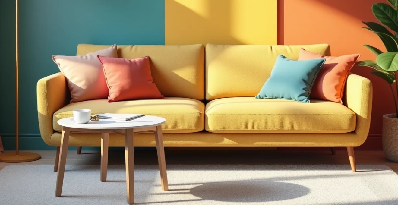
The fundamental distinction between warm and cool colours forms the cornerstone of effective interior colour psychology, with each category triggering distinct physiological and emotional responses. Warm colours, including reds, oranges, and yellows, contain longer wavelengths that stimulate the sympathetic nervous system, naturally increasing heart rate and creating feelings of energy, excitement, and intimacy. These hues appear to advance visually, making spaces feel more enclosed and cosy, which explains their effectiveness in creating welcoming social environments such as dining rooms and living areas.
Cool colours, encompassing blues, greens, and violets, operate with shorter wavelengths that activate the parasympathetic nervous system, promoting relaxation, concentration, and mental clarity. These hues recede visually, creating the illusion of expanded space and enhanced airiness, making them particularly valuable in smaller rooms or areas designated for rest and contemplation. Research conducted by environmental psychologists indicates that cool-toned environments can reduce cortisol levels by up to 15% , demonstrating the measurable impact of colour temperature on stress reduction.
Psychological response mechanisms to red, blue, and yellow primary hues
Red, as the most psychologically stimulating primary colour, triggers immediate attention responses and can increase appetite, heart rate, and social interaction levels. In interior applications, red works exceptionally well as an accent colour rather than a dominant scheme, particularly in dining areas where its appetite-stimulating properties enhance the dining experience. However, excessive red exposure can lead to agitation and restlessness, making careful application essential for maintaining psychological balance.
Blue demonstrates remarkable versatility in interior psychology, with lighter shades promoting tranquillity and deeper tones encouraging focus and productivity. Studies show that blue environments can enhance cognitive performance by up to 12%, making it an excellent choice for home offices and study areas. The colour’s association with stability and trust also makes it particularly effective in bedrooms, where psychological security contributes to improved sleep quality.
Yellow, the most luminous primary colour, stimulates mental activity and promotes optimism whilst potentially increasing metabolism. Its ability to reflect light makes it particularly valuable in naturally dark spaces, though overuse can create visual fatigue and anxiety. Professional designers often recommend limiting yellow to no more than 20% of a room’s colour palette to maintain its positive psychological benefits whilst avoiding overstimulation.
Neurological impact of colour saturation and luminosity levels
The intensity and brightness of colours significantly influence their psychological impact, with highly saturated hues creating more dramatic emotional responses than their muted counterparts. High saturation levels activate the brain’s attention centres more intensively, which can be beneficial for creating focal points and energising spaces but may prove overwhelming in environments designated for relaxation or extended occupancy.
Luminosity, or the perceived brightness of a colour, affects spatial perception and mood regulation through its interaction with circadian rhythm mechanisms. Colours with higher luminosity values can compensate for limited natural light whilst promoting alertness, whereas lower luminosity levels support evening relaxation and sleep preparation. The strategic manipulation of both saturation and luminosity allows designers to create environments that support natural biological rhythms whilst maintaining visual interest.
Cultural colour associations in western european interior design contexts
Cultural conditioning significantly influences colour perception and acceptance, with Western European design traditions establishing specific associations that affect psychological comfort levels. Green, for instance, carries strong associations with nature and growth in European contexts, making it psychologically soothing and widely accepted across various applications. These cultural colour meanings often override individual preferences, making awareness of regional associations crucial for successful design implementation.
The historical use of specific colours in European architecture and decorative arts has created deep-seated psychological associations that continue to influence contemporary design preferences. Understanding these cultural colour codes enables designers to leverage existing positive associations whilst avoiding colours that may carry negative connotations within specific cultural contexts.
Advanced colour harmony systems and mathematical relationships
Complementary colour schemes using the itten colour wheel methodology
Johannes Itten’s colour wheel methodology provides a scientific foundation for creating visually balanced complementary schemes that naturally satisfy human visual perception requirements. Complementary colours, positioned directly opposite each other on the colour wheel, create maximum contrast whilst maintaining visual harmony through their mathematical relationship. This contrast stimulates the eye’s natural tendency to seek balance, creating schemes that feel both dynamic and restful.
The practical application of complementary schemes in interior design requires careful attention to proportion and intensity to avoid visual discord. Professional designers typically employ the 60-30-10 rule, using one colour as the dominant scheme (60%), its complement as secondary accent (30%), and neutral tones for balance (10%). This mathematical approach ensures that complementary colours enhance rather than compete with each other, creating sophisticated environments that maintain visual interest without becoming overwhelming.
The most successful complementary schemes leverage the natural visual tension between opposing colours to create spaces that feel both energising and balanced, demonstrating the power of mathematical colour relationships in interior design.
Triadic and Split-Complementary arrangements for dynamic visual balance
Triadic colour schemes, utilising three colours equally spaced around the colour wheel, offer greater complexity and visual richness than simple complementary arrangements whilst maintaining mathematical harmony. These schemes provide multiple colour interaction opportunities, enabling designers to create layered, sophisticated environments that support various functional requirements within a single space. The mathematical precision of triadic relationships ensures visual balance even with multiple active colours.
Split-complementary schemes offer a more nuanced approach to contrast, replacing the direct complement with its two adjacent neighbours on the colour wheel. This modification reduces the intensity of direct complementary contrast whilst maintaining visual interest and mathematical harmony. Split-complementary arrangements prove particularly effective in spaces requiring both visual stimulation and psychological comfort , such as family living areas or creative workspaces.
Analogous colour progressions in scandinavian and minimalist design
Analogous colour schemes, featuring colours positioned adjacent to each other on the colour wheel, create naturally harmonious environments that support the psychological principles underlying Scandinavian design philosophy. These schemes promote visual calm and psychological comfort through their gentle colour transitions, making them particularly effective in spaces designated for relaxation and contemplation. The subtle variation within analogous schemes provides visual interest without creating the stimulation associated with high-contrast arrangements.
The mathematical relationship between analogous colours creates a sense of visual flow that supports the minimalist principle of reducing visual complexity whilst maintaining aesthetic interest. This approach proves particularly effective in open-plan living spaces where colour continuity helps unite different functional areas whilst maintaining the clean, uncluttered aesthetic that characterises contemporary Scandinavian design approaches.
Monochromatic schemes with strategic tonal variations
Monochromatic colour schemes demonstrate the sophisticated use of tonal variation within a single hue family, creating depth and visual interest through strategic manipulation of saturation and luminosity rather than hue contrast. These schemes offer psychological comfort through their inherent unity whilst providing sufficient variation to prevent visual monotony. The mathematical precision required to balance different tones within a monochromatic scheme demands careful attention to proportional relationships and lighting considerations.
Professional implementation of monochromatic schemes requires sophisticated understanding of how different tones interact under various lighting conditions and how textural elements can enhance tonal distinctions. The success of these schemes depends on creating sufficient contrast through value differences whilst maintaining the harmonious unity that makes monochromatic arrangements psychologically satisfying and visually sophisticated.
Room-specific colour psychology and functional applications
Understanding the functional requirements of different spaces enables strategic colour selection that supports specific activities whilst maintaining overall home harmony. Bedrooms benefit from colours that promote relaxation and sleep quality, with research indicating that blue-toned environments can improve sleep duration by up to 7 hours and 52 minutes compared to purple or brown environments. The psychological association of blue with stability and calm makes it particularly effective for creating restorative bedroom environments that support natural circadian rhythms.
Kitchen spaces require colours that stimulate appetite and promote social interaction whilst maintaining cleanliness associations. Warm colours such as yellow and orange naturally increase appetite and create welcoming environments for food preparation and consumption. However, these colours must be balanced with cooler accents to prevent overstimulation and maintain the psychological associations with cleanliness that are essential in food preparation areas. Green accents can provide this balance whilst reinforcing positive associations with fresh, natural ingredients.
Home office environments benefit from colours that enhance focus and productivity without creating visual fatigue during extended work periods. Blue-green combinations prove particularly effective, with the blue component supporting concentration and the green element reducing eye strain associated with computer work. Studies demonstrate that green environments can improve creative thinking by up to 20% , making it an excellent choice for creative professionals working from home.
Bathroom spaces present unique colour psychology challenges, requiring schemes that promote cleanliness associations whilst creating spa-like relaxation environments. Cool colours such as soft blues and greens reinforce cleanliness associations whilst promoting the calm atmosphere associated with personal care routines. However, these colours must be warmed through lighting or accent colours to prevent the sterile, clinical associations that can interfere with relaxation and comfort.
Technical colour selection for different lighting conditions
Natural daylight colour rendering index (CRI) considerations
The Colour Rendering Index (CRI) measures how accurately colours appear under different light sources compared to natural daylight, with implications for colour selection and psychological comfort. Natural daylight, with its perfect CRI of 100, reveals colours in their truest form, making it essential to evaluate colour choices under various daylight conditions throughout the day. Morning light tends toward cooler temperatures (5000-6500K), whilst afternoon light becomes warmer (3000-4000K), significantly affecting how colours appear and feel psychologically.
Rooms receiving limited natural light require careful colour selection to compensate for reduced CRI values from artificial lighting sources. Colours that appear vibrant and appealing under natural light may appear dull or distorted under artificial lighting with lower CRI values, potentially affecting the psychological impact of the space. Understanding these technical limitations enables more informed colour selection that maintains psychological effectiveness across varying lighting conditions.
LED and halogen artificial light impact on paint colour appearance
LED lighting technology has revolutionised interior colour considerations, offering variable colour temperatures and improved CRI values compared to traditional incandescent sources. However, the specific spectral composition of LED lights can emphasise certain colour wavelengths whilst diminishing others, affecting how paint colours appear and their psychological impact. Cool LED lights (5000K+) can make warm colours appear muted whilst enhancing cool tones, potentially altering the intended psychological effect of colour schemes.
Halogen lighting, with its warmer colour temperature (typically 3000K), enhances warm colours whilst potentially making cool colours appear grey or lifeless. This technical consideration becomes crucial when designing spaces that rely on cool colour psychology for relaxation or productivity benefits. Professional colour selection increasingly requires testing under multiple lighting scenarios to ensure consistent psychological impact regardless of lighting conditions.
Metamerism effects in North-Facing versus South-Facing rooms
Metamerism, the phenomenon where colours that match under one light source appear different under another, significantly affects colour selection strategies for rooms with different orientations. North-facing rooms receive cooler, more consistent light throughout the day, making them ideal for colours that benefit from stable lighting conditions but requiring careful selection to avoid colours that may appear too cool or grey under consistent indirect light.
South-facing rooms experience dramatic lighting changes throughout the day, from cool morning light to warm afternoon sun, creating metameric challenges for colour schemes. Colours selected for these spaces must maintain their psychological effectiveness across varying colour temperatures, often requiring more robust, saturated colours that can withstand lighting variations without losing their intended impact. Understanding these technical lighting considerations enables more sophisticated colour selection that maintains psychological effectiveness regardless of orientation or time of day.
Professional colour matching techniques and industry standards
Pantone and RAL colour system applications for interior design
Professional colour matching systems such as Pantone and RAL provide standardised colour references that ensure consistency across different materials and applications within interior design projects. The Pantone Matching System, whilst primarily developed for graphic design, offers valuable tools for interior applications through its extensive colour libraries and digital colour matching capabilities. These systems enable precise colour communication between designers, manufacturers, and clients, reducing the ambiguity that can compromise colour scheme effectiveness.
RAL colour standards, widely used in European markets, provide standardised colour references particularly valuable for architectural elements and large-scale applications. The RAL system’s focus on practical applications and fade resistance makes it particularly valuable for interior elements that must maintain colour integrity over extended periods. Professional understanding of these systems enables more precise colour specification and ensures that intended psychological effects are maintained consistently across different materials and applications.
Digital colour sampling with spectrophotometer technology
Modern spectrophotometer technology enables precise colour measurement and matching that eliminates much of the guesswork traditionally associated with colour selection. These devices measure the specific wavelengths reflected by surfaces, providing objective colour data that can be matched across different materials and lighting conditions. This technical precision becomes particularly valuable when creating complex colour schemes that must maintain harmony across various textures and materials.
Digital colour sampling also enables more accurate prediction of how colours will appear under different lighting conditions, supporting more informed colour selection decisions. The ability to measure and predict colour behaviour reduces the risk of colour schemes that fail to achieve their intended psychological effects, making spectrophotometer technology an increasingly valuable tool for professional colour specification and quality control.
Paint manufacturer colour libraries: farrow & ball and benjamin moore analysis
Premium paint manufacturers such as Farrow & Ball and Benjamin Moore have developed sophisticated colour libraries based on historical research, psychological principles, and technical performance standards. Farrow & Ball’s approach emphasises traditional pigment formulations and complex undertones that create depth and richness whilst maintaining historical authenticity. Their colours often demonstrate superior performance under various lighting conditions due to their complex pigment compositions and sophisticated undertone structures.
Benjamin Moore’s colour system focuses on technical consistency and widespread application whilst maintaining sophisticated colour relationships. Their Affinity Colour System provides mathematical relationships between colours that support professional colour scheme development whilst ensuring consistency across different product lines and application methods. Professional designers increasingly rely on these sophisticated colour systems rather than attempting to create custom colour relationships from basic mixing principles.
LRV (light reflectance value) calculations for optimal room brightness
Light Reflectance Value (LRV) measurements provide objective data about how much light a colour reflects, with significant implications for both energy efficiency and psychological comfort. Colours with high LRV values (70-90) reflect substantial amounts of light, making spaces feel brighter and more spacious whilst reducing artificial lighting requirements. However, excessive LRV can create glare and visual fatigue, particularly in spaces with abundant natural light.
Strategic LRV planning enables designers to create appropriate brightness levels for different functional requirements whilst maintaining colour scheme integrity. Bedrooms may benefit from lower LRV values (30-50) that support relaxation and sleep preparation, whilst home offices require higher LRV values (60-80) that support alertness and productivity. Understanding LRV calculations enables more sophisticated colour selection that balances psychological requirements with practical lighting considerations and energy efficiency goals.
Contemporary colour trends and Evidence-Based design strategies
Current colour trends increasingly reflect scientific understanding of colour psychology rather than purely aesthetic preferences, with evidence-based design strategies gaining prominence in professional practice. The growing awareness of colour’s impact on mental health and productivity has led to more sophisticated approaches that prioritise psychological well-being alongside visual appeal. Biophilic colour palettes, inspired by natural environments, demonstrate measurable benefits for stress reduction and cognitive performance, making them increasingly popular in both residential and commercial applications.
The integration of smart lighting technology with colour psychology principles represents a significant advancement in interior design capabilities. Variable colour temperature lighting systems enable dynamic colour environments that support natural circadian rhythms whilst maintaining the psychological benefits of specific colour schemes. These technological developments allow for more sophisticated colour strategies that adapt to changing functional requirements throughout the day whilst maintaining overall design harmony.
Sustainable colour selection practices have emerged as significant considerations in contemporary design, with low-VOC paints
and colour-matching technologies now enable designers to predict long-term colour performance and maintenance requirements, ensuring that colour schemes maintain their psychological effectiveness over extended periods. These sustainable practices align with growing consumer awareness of environmental impact whilst supporting the creation of healthier indoor environments.The emergence of circadian lighting design represents a paradigm shift in how colour and light interact within residential spaces. Research demonstrates that exposure to specific colour temperatures at different times of day can significantly impact sleep quality, mood regulation, and cognitive performance. Modern colour schemes increasingly incorporate these findings, selecting colours that work harmoniously with circadian lighting systems to create environments that actively support natural biological rhythms.Evidence-based colour selection is rapidly becoming the standard in professional interior design, with designers increasingly relying on peer-reviewed research rather than traditional colour theory alone. This scientific approach has led to the development of colour prescription protocols for specific psychological outcomes, enabling more targeted and effective colour interventions in residential environments. The integration of environmental psychology research with traditional design principles represents a significant evolution in how colour is understood and applied in contemporary interior design.Neuroaesthetics, the study of how aesthetic experiences affect the brain, provides additional scientific foundation for colour selection strategies. This emerging field demonstrates that certain colour combinations activate specific neural pathways associated with pleasure, calm, or alertness, offering objective measures for colour scheme effectiveness. Professional designers increasingly utilise these neurological insights to create colour environments that support specific lifestyle goals whilst maintaining visual sophistication and personal expression.The future of residential colour design lies in the integration of these scientific insights with emerging technologies and sustainable practices. Smart home systems that adjust colour environments based on occupant behaviour patterns, seasonal changes, and specific wellness goals represent the next evolution in colour psychology applications. These technological advances enable dynamic colour environments that provide optimal psychological support whilst maintaining the aesthetic integrity that makes houses feel like homes.