Creating a harmonious interior through strategic decorative arrangements requires more than simply placing beautiful objects around your home. The art of clustering and grouping décor elements draws from fundamental design principles that professional interior designers have refined over decades. When executed thoughtfully, these techniques transform disparate objects into cohesive vignettes that tell a compelling visual story whilst maintaining functional beauty throughout your living spaces.
The psychology behind successful decorative groupings lies in our innate preference for organised visual information. Our brains naturally seek patterns, balance, and relationships between objects, making well-curated clusters more pleasing than random arrangements. This biological predisposition explains why certain groupings immediately capture attention whilst others feel chaotic or incomplete, regardless of the individual beauty of each component piece.
Understanding visual weight distribution in decorative clustering principles
Visual weight forms the foundation of successful decorative clustering, determining how each element within a grouping commands attention and contributes to overall balance. Unlike physical weight, visual weight encompasses factors such as colour intensity, texture complexity, size, and positioning within the arrangement. Dark colours naturally carry more visual weight than light ones, whilst intricate textures draw the eye more readily than smooth surfaces.
Understanding this concept allows you to create arrangements that feel stable and intentional rather than haphazard. For instance, a small dark ceramic vase positioned alongside a larger light-coloured sculpture can achieve perfect equilibrium when their visual weights complement rather than compete with each other. This principle extends beyond individual objects to encompass entire room compositions where multiple clusters must work together harmoniously.
Implementing the rule of thirds for asymmetrical balance in vignettes
The rule of thirds, borrowed from photography and fine art, provides a reliable framework for creating dynamic decorative arrangements. This principle involves dividing your display area into nine equal sections using two horizontal and two vertical lines, then positioning key elements along these lines or at their intersections. This technique prevents centred, static compositions whilst ensuring visual stability through deliberate asymmetry.
When applying this rule to shelf styling or mantelpiece arrangements, consider placing your most visually striking piece at one of the intersection points rather than dead centre. The remaining elements should then be distributed to create balance without perfect symmetry. This approach mimics the natural asymmetry found in organic compositions, making your arrangements feel more relaxed and visually engaging than rigid, symmetrical displays.
Creating focal points through scale variation and height differentiation
Successful decorative clusters require a clear hierarchy of importance, achieved through strategic scale variation and height differentiation. Your arrangement should feature one dominant focal point supported by secondary and tertiary elements that enhance rather than compete with the primary piece. This hierarchy guides the viewer’s eye through the composition in a predetermined sequence, creating visual flow and preventing confusion.
Height variation serves multiple purposes within decorative groupings. Stepped arrangements create depth and dimension, whilst varied heights prevent the monotonous horizontal lines that characterise amateur displays. Consider incorporating objects of dramatically different heights within a single cluster, such as pairing a tall candlestick with a low, wide bowl and a medium-height sculpture to create an engaging triangular silhouette.
Applying colour temperature theory in grouped object arrangements
Colour temperature plays a crucial role in determining whether your decorative clusters feel cohesive or disjointed. Warm colours (reds, oranges, yellows) advance visually and create intimate, cosy atmospheres, whilst cool colours (blues, greens, purples) recede and promote calm, spacious feelings. Understanding these psychological effects allows you to manipulate the perceived size and mood of your arrangements through strategic colour selection.
When grouping objects, consider their colour temperatures alongside their hues. A cluster dominated by warm-toned pieces will feel more intimate and energetic than one featuring predominantly cool tones. However, the most sophisticated arrangements often incorporate both warm and cool elements in carefully balanced proportions, creating visual tension that maintains viewer interest without causing discomfort.
Utilising negative space management for breathing room between clusters
Negative space, or the empty areas surrounding your decorative elements, requires as much consideration as the objects themselves. Proper negative space management prevents visual overcrowding whilst allowing each element within your clusters to maintain its individual identity. Think of negative space as the silence between musical notes – essential for creating rhythm and allowing the composition to breathe.
The amount of negative space required varies depending on the visual weight of your objects and the overall design aesthetic you’re pursuing. Minimalist arrangements benefit from generous negative space that emphasises each object’s unique qualities, whilst maximalist approaches can accommodate tighter groupings provided the visual hierarchy remains clear. Remember that negative space isn’t merely empty area – it’s an active design element that shapes how viewers perceive your arrangements.
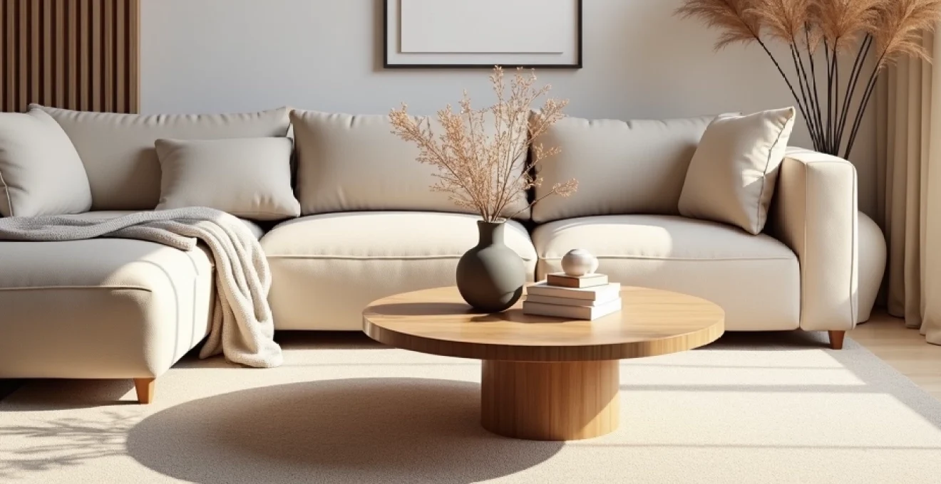
Mastering the triangle composition method for Three-Object groupings
The triangle composition method represents one of the most reliable approaches to creating visually pleasing three-object groupings. This technique harnesses the inherent stability of triangular forms whilst providing sufficient flexibility to accommodate objects of varying sizes, shapes, and visual weights. The triangle need not be perfectly geometric – implied triangular relationships between objects create equally effective compositions whilst appearing more natural and relaxed.
Professional designers often employ this method because triangular compositions naturally guide the eye through the arrangement whilst maintaining balance and preventing any single element from dominating completely. The key lies in positioning your three objects so their visual centres form triangular points, with the most prominent piece typically occupying the apex position. This arrangement creates a sense of movement and hierarchy that keeps viewers engaged whilst maintaining overall stability.
Establishing primary, secondary, and tertiary elements in triangular displays
Every successful triangular arrangement requires clear designation of primary, secondary, and tertiary elements. The primary element should command the most attention through size, colour, texture, or positioning, serving as the arrangement’s anchor point. Secondary elements support and complement the primary piece without overwhelming it, whilst tertiary elements provide subtle accent points that complete the composition.
Consider a mantelpiece arrangement featuring a large mirror as the primary element, flanked by two medium-sized candlesticks as secondary elements, with small decorative objects serving as tertiary accents. This hierarchy ensures visual stability whilst preventing any single area from appearing too heavy or neglected. The key lies in maintaining clear distinctions between these hierarchical levels without creating jarring contrasts that disrupt the overall harmony.
Incorporating texture contrast through material selection in triadic arrangements
Texture contrast within three-object groupings adds visual interest and prevents monotony, even when colour palettes remain constrained. The interplay between smooth and rough, matte and glossy, or hard and soft surfaces creates tactile appeal that engages viewers on multiple sensory levels. This technique proves particularly valuable in monochromatic arrangements where texture variation compensates for limited colour diversity.
When selecting materials for triadic arrangements, aim for complementary rather than competing textures. A rough ceramic pot pairs beautifully with smooth glass and polished metal, creating a sophisticated material dialogue that enhances each component’s unique qualities. Avoid overwhelming your arrangements with too many contrasting textures – three distinct material types typically provide sufficient variety without creating visual chaos.
Balancing geometric and organic forms within Triangle-Based vignettes
The tension between geometric and organic forms creates compelling visual dynamics within triangular arrangements. Geometric objects provide structure and stability, whilst organic forms introduce movement and natural appeal. The most sophisticated arrangements leverage this contrast to create compositions that feel both organised and alive, appealing to our dual preferences for order and natural beauty.
Consider pairing angular ceramic vessels with curved sculptures and spherical objects to create engaging form relationships. The geometric elements provide visual anchors, whilst organic shapes soften the overall composition and prevent rigidity. This balance reflects the broader design principle of combining structured and free-form elements to create harmonious living environments that feel both intentional and comfortable.
Positioning techniques for Odd-Numbered collections using golden ratio principles
The golden ratio, a mathematical proportion found throughout nature and classical architecture, provides sophisticated guidelines for positioning elements within odd-numbered collections. This ratio (approximately 1:1.618) creates inherently pleasing proportional relationships that feel natural and balanced to human perception. Incorporating golden ratio principles into your decorative arrangements elevates them beyond basic clustering into refined compositions worthy of professional admiration.
Apply golden ratio principles by positioning your most important element approximately one-third of the way across your display area rather than at the mathematical centre. This placement creates dynamic asymmetry whilst maintaining visual stability. The remaining elements should then be distributed according to similar proportional relationships, creating a sophisticated mathematical harmony that viewers perceive as naturally beautiful without consciously understanding the underlying structure.
Strategic layering techniques for Multi-Dimensional décor displays
Layering transforms flat, two-dimensional arrangements into rich, multi-dimensional displays that reward closer inspection. This technique involves positioning objects at varying depths to create visual complexity and spatial interest. Effective layering requires careful consideration of sightlines, ensuring that each element remains visible whilst contributing to the overall composition’s depth and richness.
The key to successful layering lies in creating clear foreground, middleground, and background elements within your arrangements. Foreground objects should be positioned closest to the viewer, often serving as entry points that draw attention into the composition. Middleground elements provide substance and body to the arrangement, whilst background pieces add context and depth without overwhelming the primary focal points.
Consider scale relationships when layering decorative elements. Larger objects typically work better in background positions where they provide stability without blocking smaller, more delicate pieces. However, breaking this rule occasionally can create dramatic effects – positioning a small, visually striking object in the foreground against a larger, more neutral background creates compelling focal emphasis through contrast rather than scale dominance.
Lighting plays a crucial role in successful layering, as shadows and highlights help define the spatial relationships between different depth layers. Position your arrangements to take advantage of natural light sources, or supplement with artificial lighting that emphasises the dimensional qualities you’ve created through strategic positioning. Remember that the goal is to create compositions that reveal new details as viewers spend more time examining them.
Colour palette coordination across multiple decorative clusters
Maintaining colour harmony across multiple decorative clusters throughout a room requires systematic planning and restraint. The most successful approaches involve establishing a master colour palette that serves as the foundation for all decorative decisions, ensuring that individual clusters complement rather than compete with each other. This doesn’t mean every arrangement must contain identical colours, but rather that all colours should relate harmoniously within your chosen scheme.
Professional designers often work with colour palettes comprising three to five core colours plus neutral tones that provide visual breathing space. This limited palette creates unity whilst offering sufficient variety to prevent monotony. The key lies in varying the proportions and intensities of these colours across different clusters rather than using them in identical combinations throughout the space.
Implementing analogous colour schemes in adjacent groupings
Analogous colour schemes, featuring colours that sit adjacent to each other on the colour wheel, create gentle, harmonious transitions between decorative clusters. This approach works particularly well for arrangements positioned near each other, such as clusters on the same shelf or adjacent surfaces. The subtle colour progression guides the eye smoothly between arrangements whilst maintaining visual coherence.
When implementing analogous schemes, consider varying the saturation and tone of your chosen colours to create interest without breaking harmony. A cluster featuring deep forest green might transition to arrangements incorporating sage green and blue-green tones, creating sophisticated colour relationships that feel natural and calming. This technique proves especially effective in creating serene, spa-like atmospheres where visual tranquillity is paramount.
Creating cohesion through repeated accent colours in scattered arrangements
Repeated accent colours serve as visual threads that connect disparate arrangements throughout a room, creating cohesion even when clusters feature different primary colours or themes. This technique involves selecting one or two accent colours that appear in small doses across multiple arrangements, creating rhythmic colour echoes that unify the overall design scheme.
The power of repeated accents lies in their subtlety – these colours should appear as minor notes rather than dominant themes within individual clusters. A touch of coral in a blue-dominated arrangement might echo coral accents in a green-themed cluster across the room, creating subliminal connections that enhance overall harmony without appearing overly coordinated or forced.
Balancing warm and cool undertones across Room-Wide cluster displays
Temperature balance across multiple decorative clusters prevents rooms from feeling too energetic or too calm, creating comfortable environments that support various activities and moods. Rooms dominated by warm colours can feel overwhelming and claustrophobic, whilst spaces featuring predominantly cool colours may appear uninviting and sterile. The solution lies in achieving thoughtful balance through strategic colour temperature distribution.
Consider the natural light conditions in your room when balancing warm and cool undertones. North-facing rooms benefit from warmer accent colours that compensate for cool natural light, whilst south-facing spaces can accommodate cooler tones that provide relief from intense warm sunlight. This environmental consideration ensures your colour choices work harmoniously with the room’s natural characteristics rather than fighting against them.
Scale progression methodologies for graduated object arrangements
Scale progression creates rhythmic movement within decorative arrangements through systematic size variations. This technique prevents visual stagnation whilst guiding viewer attention through compositions in controlled sequences. The most effective scale progressions follow mathematical or musical principles, creating harmonious relationships between objects of different sizes that feel natural rather than random.
Consider implementing Fibonacci progressions in your arrangements, where each object relates proportionally to its neighbours according to this naturally occurring mathematical sequence. A small candlestick might be followed by a medium vase, then a larger sculpture, with each element approximately 1.6 times larger than its predecessor. This creates sophisticated proportional relationships that resonate with viewers on an intuitive level.
Graduated arrangements work particularly well on long surfaces such as dining tables or console tables where you have sufficient space to develop the progression fully. Begin with your smallest objects at one end and progress systematically toward larger pieces, or create symmetrical progressions that build toward a central focal point. The key lies in maintaining consistent proportional relationships that create visual rhythm without appearing mechanical or obvious.
Remember that scale progression need not involve dramatic size differences to be effective. Subtle gradations between objects of similar scale can create gentle rhythmic effects that enhance rather than dominate your overall design scheme. These nuanced progressions often prove more sophisticated than dramatic scale contrasts, creating refined visual effects that reward careful observation.
Repetition strategies for establishing visual rhythm in clustered décor
Repetition creates visual rhythm within and between decorative clusters through systematic recurrence of design elements such as shapes, colours, textures, or materials. This technique unifies complex arrangements whilst preventing visual chaos, much like musical rhythm provides structure that allows individual notes to create beautiful compositions. The key lies in achieving sufficient repetition to create coherence without falling into monotonous predictability.
Effective repetition strategies might involve echoing circular forms across multiple arrangements, repeating specific material combinations, or creating colour rhythms that pulse throughout your decorative scheme. Consider repeating elements at regular intervals – perhaps every third arrangement features a brass accent, or spherical objects appear in alternating clusters. These patterns create subliminal organisation that viewers perceive as sophistication rather than obvious coordination.
Variation within repetition prevents arrangements from becoming boring or predictable. While maintaining your repetitive elements, vary their scale, colour intensity, or positioning to create interest whilst preserving the underlying rhythmic structure. A repeated circular motif might appear as a large ceramic bowl in one arrangement, medium metal spheres in another, and small glass orbs in a third, maintaining the rhythmic theme whilst providing sufficient variety to sustain viewer interest.
The most sophisticated repetition strategies combine multiple rhythmic elements simultaneously. You might establish both colour and shape rhythms that interact and overlap throughout your arrangements, creating complex visual compositions that reward extended observation. This layered approach to repetition reflects the complexity found in nature, where multiple patterns interact harmoniously to create rich, engaging environments that never become tiresome or predictable.