Creating a harmonious interior design doesn’t require gutting your entire home or investing in completely new furnishings. Many homeowners find themselves surrounded by furniture and decorative elements they love individually, yet struggle to make these pieces work together as a unified whole. The key lies in understanding how to analyse your existing possessions through a professional lens and implementing strategic design principles that bridge the gaps between different styles, periods, and aesthetics.
Professional interior designers often work with clients’ existing pieces, transforming seemingly disparate collections into cohesive design schemes that feel intentional and polished. This approach not only saves money but also preserves sentimental pieces whilst creating a home that truly reflects your personality and lifestyle. The secret lies in understanding the underlying design elements that create visual harmony and learning to identify the common threads that already exist within your space.
Auditing your existing furniture and decorative elements for style cohesion
Before making any new purchases or rearranging your space, conducting a thorough audit of your existing pieces provides the foundation for building a cohesive design scheme. This systematic approach allows you to identify patterns, assess compatibility, and understand the design language your home is already speaking.
Cataloguing colour palettes using the munsell colour system
The Munsell colour system provides a scientific approach to understanding the relationships between colours in your space. Unlike traditional colour wheels, this system breaks colours down into three dimensions: hue (the colour family), value (lightness or darkness), and chroma (intensity or saturation). By cataloguing your existing pieces using these parameters, you can identify which colours work harmoniously together and which create visual discord.
Begin by photographing each significant piece in your room under natural light. Group these images by colour family and analyse their Munsell values. You’ll likely discover that pieces you thought clashed actually share similar value levels or complementary chroma intensities. This revelation becomes the cornerstone for developing your unified colour strategy moving forward.
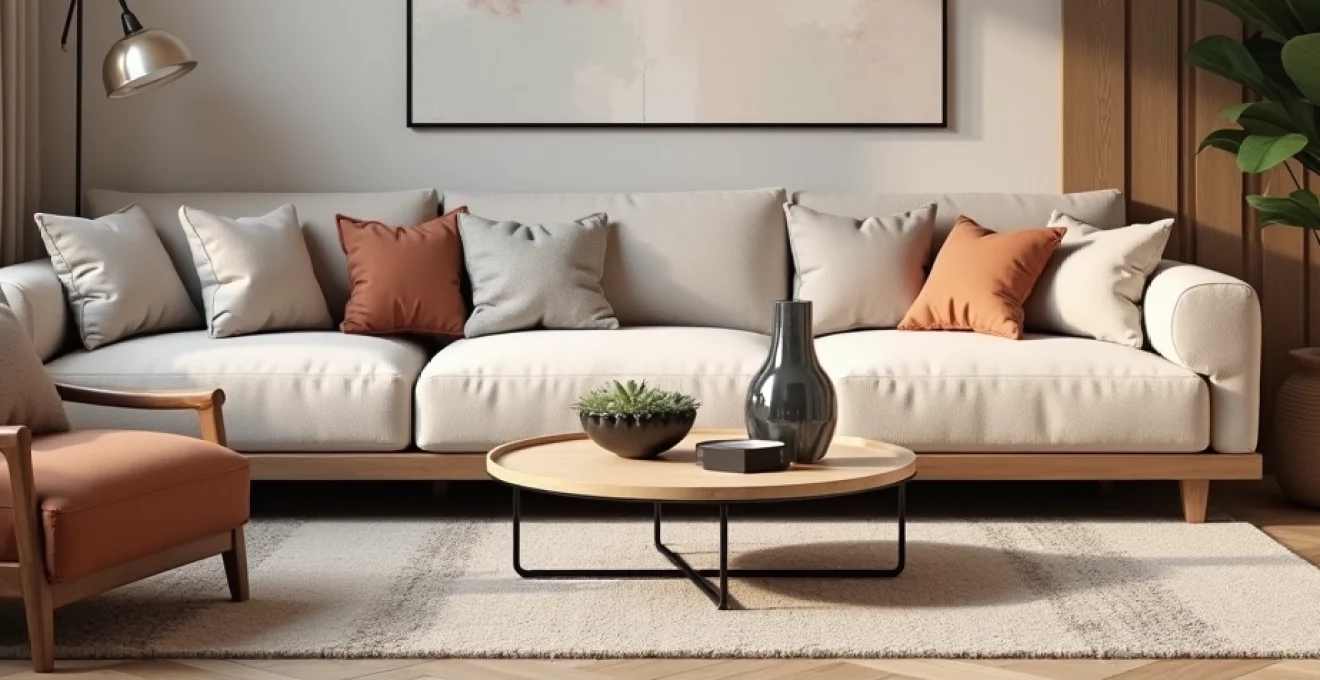
Identifying dominant design movements: Mid-Century modern vs scandinavian minimalism
Understanding the design movements represented in your existing furniture helps you make informed decisions about future additions. Mid-century modern pieces typically feature clean lines, warm woods like walnut or teak, and bold geometric patterns. These elements create a sense of optimism and functionality that defined the post-war era.
Scandinavian minimalism, conversely, emphasises light woods, neutral palettes, and functional beauty. The hygge philosophy underlying this movement prioritises comfort and cosiness whilst maintaining visual simplicity. Recognising whether your existing pieces lean towards one movement or another—or perhaps blend elements of both—allows you to build upon these established themes rather than fighting against them.
Assessing texture hierarchies through tactile material analysis
Texture plays a crucial role in creating visual interest and depth within interior spaces. Professional designers understand that successful rooms require a careful balance of smooth and rough textures, soft and hard surfaces, and matte and glossy finishes. Analysing your existing pieces through this lens reveals opportunities for strategic additions that enhance rather than compete with established textures.
Consider the tactile qualities of your largest furniture pieces first—leather sofas provide smooth, refined texture, whilst jute rugs add organic roughness. Natural wood furniture contributes warmth and grain variation, whilst glass elements introduce reflective surfaces. Mapping these textural relationships helps identify where additional texture might enhance the overall sensory experience of your space.
Measuring proportional relationships using the golden ratio method
The golden ratio (1:1.618) appears throughout nature and has guided artistic composition for centuries. Applying this mathematical principle to your existing furniture arrangement reveals why certain groupings feel harmonious whilst others appear awkward or unbalanced. Professional designers use this ratio to determine optimal furniture spacing, artwork sizing, and room proportions.
Measure the dimensions of your key furniture pieces and calculate their proportional relationships. Sofas and coffee tables that follow golden ratio proportions create natural visual harmony, whilst pieces that deviate significantly may require strategic styling or repositioning to achieve balance. This analytical approach transforms intuitive design decisions into calculated choices based on proven aesthetic principles.
Strategic colour theory implementation for unified interior schemes
Building upon your colour audit, implementing strategic colour theory transforms individual pieces into components of a larger, cohesive design narrative. Professional colour theory extends beyond simple matching, incorporating concepts of visual temperature, psychological impact, and light interaction to create sophisticated interior schemes.
Applying monochromatic schemes with farrow & ball paint references
Monochromatic colour schemes utilise various shades, tints, and tones of a single colour to create sophisticated, harmonious interiors. Farrow & Ball’s carefully curated palette demonstrates how subtle variations within a single colour family can create remarkable depth and interest. Their “Elephant’s Breath” family, for instance, includes cooler and warmer variations that work beautifully together whilst maintaining visual unity.
When working with existing furniture, identify the dominant colour family present in your largest pieces. If your sofa features warm grey upholstery, consider incorporating walls painted in complementary grey tones—perhaps a lighter “Skimming Stone” for brightness or a deeper “Down Pipe” for drama. This approach allows existing pieces to feel intentionally chosen rather than accidentally coordinated.
Creating analogous colour transitions through benjamin moore collections
Analogous colour schemes use colours adjacent to each other on the colour wheel, creating gentle transitions that feel natural and calming. Benjamin Moore’s Historical Collection demonstrates how blues can flow into greens, or how warm beiges can transition into soft yellows. These subtle progressions create visual movement throughout interior spaces without jarring contrasts.
Apply this principle by identifying the secondary colours present in your existing pieces. A navy blue armchair might be paired with walls in “Aegean Teal,” creating a sophisticated blue-green progression. Wooden furniture with warm undertones benefits from colours like “Hawthorne Yellow” or “Sedona Clay,” which share similar temperature qualities whilst introducing subtle variation.
Incorporating accent colours using the 60-30-10 rule
The 60-30-10 rule provides a foolproof formula for colour distribution within interior spaces. Sixty percent of the room should feature a dominant neutral colour, thirty percent should showcase a secondary colour, and ten percent should incorporate bold accent colours. This proportion creates visual balance whilst allowing for personality and interest through carefully chosen highlights.
If your existing furniture already establishes the dominant sixty percent through neutral upholstery and natural wood tones, focus on developing the thirty percent through window treatments, area rugs, or larger decorative elements. The final ten percent comes through accessories, artwork, and smaller decorative objects that can be easily changed as your tastes evolve. This systematic approach ensures that new additions enhance rather than overwhelm your established palette.
Balancing warm and cool undertones in natural light variations
Understanding how natural light affects colour perception throughout the day enables you to make informed decisions about colour placement and intensity. North-facing rooms receive cooler, more consistent light that can make warm colours appear muddy, whilst south-facing spaces benefit from abundant warm light that can wash out pale colours.
Test your existing colour palette at different times of day, noting how morning light, midday brightness, and evening warmth affect the appearance of your furnishings. Colours that appear perfectly coordinated in afternoon light might clash under morning conditions. This awareness helps you choose complementary colours and textures that maintain harmony regardless of lighting conditions, ensuring your cohesive scheme works throughout the entire day .
Textile layering techniques for visual continuity
Textiles serve as the connective tissue of interior design, weaving together disparate elements through shared colours, patterns, or textures. Professional designers understand that strategic textile choices can transform a collection of mismatched furniture into a cohesive, professionally styled space. The key lies in identifying the common threads—both literal and figurative—that already exist within your possessions.
Begin by cataloguing all existing textiles: upholstery fabrics, curtains, rugs, throw pillows, and bedding. Look for shared elements such as colour families, pattern scales, or material types. A velvet sofa, linen curtains, and wool rug might initially seem incompatible, yet they share a common thread of natural fibres and tactile richness that sophisticated layering can highlight.
Consider the principle of pattern mixing, where different designs work together through shared colour palettes or complementary scales. A large-scale floral pattern pairs beautifully with small geometric prints when they share similar colour intensities. Stripe patterns act as neutrals, bridging gaps between more complex designs whilst adding linear interest to curved furniture forms.
Professional textile layering also considers seasonal adaptability. Lightweight cottons and linens create fresh, breathable environments for warmer months, whilst wool, cashmere, and heavier weaves provide cosy warmth during cooler periods. Building a textile wardrobe for your home allows you to refresh the space’s appearance without major furniture changes, maintaining visual interest whilst preserving your fundamental design cohesion .
Lighting design integration using kelvin temperature coordination
Lighting quality significantly impacts how colours appear and how cohesive your design scheme feels throughout different times of day. Kelvin temperature measurement provides a scientific approach to coordinating various light sources within your home. Warm light (2700K-3000K) enhances reds, oranges, and yellows whilst making blues appear muddy, whereas cool light (4000K-5000K) brings out blues and greens whilst washing out warm tones.
Assess your existing lighting fixtures and their colour temperatures. Table lamps with warm incandescent bulbs create intimate pools of golden light that complement warm wood furniture and rich textiles. Meanwhile, cooler LED ceiling fixtures provide task lighting that works well with contemporary furniture and neutral colour schemes. Coordinating these temperatures ensures that your carefully chosen colour palette appears consistent regardless of which lights are illuminated.
Layer your lighting design by combining ambient, task, and accent lighting sources, each calibrated to similar Kelvin temperatures. This approach creates depth and visual interest whilst maintaining colour consistency. Consider how different lighting scenarios affect your existing furniture—candlelight might make your brown leather sofa appear rich and inviting, whilst harsh overhead fluorescents could make the same piece look tired and outdated.
Professional lighting design also considers the interaction between natural and artificial light sources. Window treatments that filter harsh sunlight whilst preserving colour accuracy help maintain your interior’s cohesive appearance throughout the day. Dimmer switches allow you to adjust artificial lighting intensity to complement changing natural light levels, ensuring your design scheme remains harmonious from morning through evening.
Spatial flow optimisation through furniture placement principles
Creating cohesive design extends beyond individual pieces to encompass how furniture relates spatially within rooms and how these relationships guide movement throughout your home. Professional space planning considers both functional requirements and aesthetic principles to create environments that feel naturally balanced and inviting.
Implementing traffic pattern analysis for room transitions
Understanding how people naturally move through spaces allows you to position furniture in ways that enhance rather than impede flow. Primary pathways should remain clear and intuitive, whilst secondary routes can incorporate interesting furniture arrangements that create conversation areas or quiet retreats.
Map the natural traffic patterns in your existing space by observing how family members and guests navigate the room. Do they consistently walk around the coffee table in the same direction? Does the sofa placement encourage conversation or create barriers? These observations reveal opportunities to optimise furniture positioning for both functionality and visual appeal .
Creating focal points using anthropologie statement pieces
Every successful room requires at least one strong focal point that anchors the design and provides visual hierarchy. Anthropologie’s curated selection of statement furniture demonstrates how bold pieces can serve as room anchors whilst complementing rather than overwhelming surrounding elements. A dramatic mirror, sculptural chair, or artistic light fixture can transform a collection of ordinary furniture into an intentionally designed space.
Identify whether your existing rooms have clear focal points or if they suffer from visual competition between multiple attention-grabbing elements. Sometimes the solution involves highlighting one existing piece through strategic positioning and lighting whilst toning down competing elements through colour coordination or textile additions.
Establishing sight lines through strategic mirror positioning
Mirrors serve dual purposes in cohesive design: they expand visual space whilst creating connections between different areas of your home. Strategic mirror placement can visually link separate rooms, reflect attractive views, and bounce light throughout darker spaces. These reflective surfaces also double the visual impact of beautiful furniture or artwork, maximising the aesthetic value of your existing pieces.
Consider positioning mirrors to reflect your most successful furniture groupings or attractive architectural features. A well-placed mirror can make a small room feel spacious whilst creating the illusion of additional furniture symmetry . Avoid positioning mirrors where they reflect clutter or awkward furniture angles, as these reflections will emphasise rather than minimise visual problems.
Balancing visual weight distribution across room zones
Visual weight refers to how heavy or light objects appear within a space, influenced by factors including size, colour, texture, and position. Dark colours, complex patterns, and large-scale pieces carry more visual weight than light colours, simple designs, and delicate furniture. Successful room design distributes visual weight evenly to create balanced, harmonious environments.
Assess your existing furniture arrangement for visual weight distribution. A heavy wooden entertainment centre on one wall requires visual balance on the opposite side—perhaps through a large artwork, substantial plant, or furniture grouping. This principle applies vertically as well as horizontally; tall bookcases need counterbalancing through lower, horizontally oriented pieces that create visual stability.
Accessory curation methods for professional interior styling
The final layer of cohesive design involves carefully curating accessories that unite your existing furniture through shared design elements. Professional styling goes beyond simply filling empty surfaces; it creates intentional vignettes that support your overall design narrative whilst adding personality and visual interest.
Successful accessory curation follows the principle of repetition with variation. Choose a consistent material palette—perhaps brass, marble, and natural wood—and repeat these materials throughout your space in different forms and scales. A brass table lamp echoes brass picture frames and cabinet hardware, creating subtle connections that reinforce your design scheme.
Consider the rule of odd numbers when grouping accessories. Collections of three or five objects create more visually interesting arrangements than pairs or even numbers. Vary the heights, shapes, and sizes within each grouping whilst maintaining shared colour or material connections. This approach creates dynamic tension that draws the eye whilst maintaining overall harmony.
Seasonal accessory rotation allows you to refresh your space’s appearance without disrupting its fundamental cohesion. Store accessories in coordinated collections that can be swapped throughout the year—lighter colours and natural textures for spring and summer, richer tones and cosy textures for autumn and winter. This strategy keeps your home feeling fresh and current whilst preserving the carefully developed relationships between your permanent furniture pieces.
Professional interior styling creates the impression that every element was chosen intentionally, even when working with existing pieces that weren’t originally intended to coordinate.
The most successful accessory strategies also consider negative space—the areas between and around objects. Overcrowded surfaces compete for attention and create visual chaos, whilst thoughtfully edited displays allow each piece to shine whilst contributing to the larger design story. Remember that empty space is itself a design element that provides rest for the eye and emphasises the beauty of carefully chosen objects.