The transformative power of colorful accent pieces in interior design cannot be overstated. These carefully chosen elements serve as the punctuation marks of home décor, breathing life into neutral spaces and creating visual interest that catches the eye without overwhelming the senses. Unlike major renovations that require significant investment and time, accent pieces offer an accessible pathway to dramatic transformation, allowing you to experiment with bold hues, textures, and patterns while maintaining the flexibility to adapt your space as trends evolve.
Modern interior design has embraced the concept of strategic colour placement , where thoughtfully positioned accent pieces create focal points that guide the eye through a room. Whether you’re working with a minimalist Scandinavian palette or a richly layered maximalist scheme, the right accent pieces can elevate your space from mundane to magnificent. The beauty lies in their versatility – a vibrant ceramic vase can anchor a neutral corner, whilst colourful textiles can soften harsh architectural lines and introduce warmth to sterile environments.
Strategic colour theory applications for interior accent placement
Understanding colour theory forms the foundation of effective accent placement in interior design. The psychological impact of colour extends far beyond aesthetic appeal, influencing mood, perception of space, and overall comfort levels within your home. Professional designers rely on established colour relationships to create harmonious schemes that feel both intentional and effortless.
The key to successful accent colour integration lies in understanding the existing undertones within your space. Cool-toned rooms benefit from warm accent pieces that create visual balance, whilst warm-toned environments can be refreshed with cooler accents that provide contrast without conflict. This approach ensures that your chosen accents enhance rather than compete with your existing décor elements.
Complementary colour schemes using Sherwin-Williams and farrow & ball palettes
Complementary colours sit opposite each other on the colour wheel, creating maximum visual impact when used together. Sherwin-Williams’ “Naval” (SW 6244) paired with warm copper accessories demonstrates this principle beautifully, whilst Farrow & Ball’s “Hague Blue” (No. 30) creates stunning contrast when accented with golden yellow ceramic pieces or amber glass vessels.
The sophistication of complementary schemes lies in their ability to create dynamic tension without overwhelming the space. Consider using the dominant colour in approximately 60% of your colour scheme, with the complementary accent comprising just 10-15% of the overall palette. This restraint ensures the accent colour maintains its impact whilst contributing to a cohesive overall design.
Triadic harmony principles with dulux heritage collection accents
Triadic colour schemes employ three colours equally spaced on the colour wheel, offering more complexity whilst maintaining visual harmony. Dulux’s Heritage Collection provides excellent examples, with their “Cornish Clay” (72RR 07/173) working beautifully alongside sage green and soft blue accents to create a sophisticated, nature-inspired palette.
The success of triadic schemes depends on establishing a clear hierarchy among the three colours. One should dominate as the primary hue, another serves as a strong secondary presence, and the third functions as an accent colour appearing in smaller doses throughout the space. This approach prevents the scheme from appearing chaotic whilst maximising the visual interest generated by the colour combination.
Analogous colour progression techniques for seamless visual flow
Analogous colour schemes utilise colours that sit adjacent to each other on the colour wheel, creating gentle progressions that feel naturally harmonious. This technique works exceptionally well for creating seamless transitions between spaces, particularly in open-plan living areas where visual flow is paramount.
Consider a progression from deep forest green through olive to warm sage, implemented through varying accent pieces across adjoining spaces. The subtle shifts in hue create interest whilst maintaining unity, allowing each area to have its own character without sacrificing cohesion. This approach is particularly effective when you want to create zones within larger spaces without using physical barriers.
Monochromatic depth creation through tonal variation methods
Monochromatic schemes rely on variations in shade, tint, and tone within a single colour family to create depth and interest. This sophisticated approach to accent placement allows for bold colour statements whilst maintaining elegant restraint. The technique involves layering different intensities of your chosen colour through various accent pieces and textures.
A monochromatic blue scheme might incorporate deep navy velvet cushions, powder blue ceramic accessories, and steel blue metal accents, creating rich visual texture through tonal variation rather than contrasting colours. The key lies in varying both the intensity and the finish of your chosen colour family, incorporating matte and glossy surfaces alongside textured and smooth materials to prevent monotony.
High-impact textile integration strategies for décor transformation
Textiles represent one of the most powerful tools in the accent piece arsenal, offering infinite possibilities for colour, pattern, and texture introduction. The strategic placement of fabric elements can dramatically alter a room’s atmosphere, from creating cosy intimacy through layered throws to adding sophisticated drama through statement window treatments.
The beauty of textile accents lies in their immediate impact and seasonal adaptability. Unlike painted walls or large furniture pieces, textile accents can be easily swapped to reflect changing seasons, evolving tastes, or special occasions. This flexibility makes them an ideal choice for those who enjoy refreshing their spaces regularly without major investment.
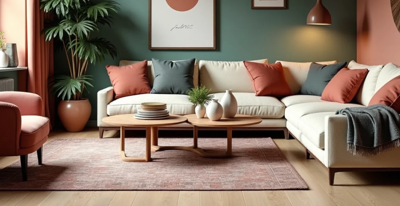
Velvet cushion clusters using designers guild and liberty london fabrics
Velvet cushions create instant luxury whilst introducing rich colour and tactile interest to seating areas. Designers Guild’s vibrant palette offers jewel tones that catch and reflect light beautifully, whilst Liberty London’s iconic prints bring pattern sophistication to the mix. The key to successful cushion clustering lies in balancing scale, colour intensity, and pattern density.
Create visual interest by mixing solid velvet cushions in complementary shades with Liberty’s subtle florals, ensuring that no two adjacent cushions share identical characteristics. This approach prevents the arrangement from appearing too matched whilst maintaining overall cohesion through careful colour coordination.
Layered throw compositions with missoni home and hermès textile lines
Layered throws offer both functional comfort and visual sophistication, particularly when sourced from luxury textile houses known for their distinctive colour palettes. Missoni Home’s signature zigzag patterns provide dynamic energy, whilst Hermès textiles bring refined elegance through their carefully considered colour combinations and superior material quality.
The art of throw layering involves creating casual sophistication through seemingly effortless arrangements. Drape a neutral cashmere throw over one arm of a sofa, then add a patterned Missoni piece casually folded nearby. This layered approach suggests comfort whilst maintaining visual interest through colour and texture contrast.
Statement rug positioning using persian tabriz and moroccan beni ourain pieces
Statement rugs serve as foundation pieces that anchor colour schemes whilst defining space boundaries. Persian Tabriz rugs bring centuries of colour tradition through their intricate patterns and rich dye heritage, whilst Moroccan Beni Ourain pieces offer geometric sophistication in naturally beautiful neutral tones that provide the perfect backdrop for colourful accent pieces.
Positioning is crucial for maximum impact – a statement rug should extend beneath all major seating pieces in a conversation area, creating visual unity whilst serving as the colour scheme’s foundation. The rug’s colours should inform your accent piece choices, creating a harmonious dialogue between floor and accessories.
Window treatment upgrades with jim thompson silk and sanderson prints
Window treatments offer one of the largest opportunities for colour introduction in any room, serving both practical and aesthetic functions. Jim Thompson silk fabrics bring lustrous colour depth that changes throughout the day as light conditions shift, whilst Sanderson’s botanical prints connect indoor spaces with the natural world through their distinctive colour palettes.
Consider the room’s orientation when selecting window treatment colours – south-facing rooms can handle cooler accent colours to balance abundant natural light, whilst north-facing spaces benefit from warmer tones that compensate for limited natural illumination. The fabric choice should complement rather than compete with other accent pieces in the room.
Botanical print integration through william morris and zoffany collections
Botanical prints bring the outdoors inside whilst providing sophisticated colour stories that work across seasons. William Morris designs offer timeless appeal through their intricate natural motifs, whilst Zoffany’s contemporary interpretations of botanical themes provide fresh perspectives on traditional patterns.
The success of botanical print integration lies in balancing the organic quality of these patterns with more structured elements in your space. Use botanical textiles to soften harsh architectural lines or to bring warmth to minimalist schemes. The natural colour palettes inherent in these designs make them particularly versatile for creating year-round appeal .
Artisanal ceramic and glass statement piece curation
Handcrafted ceramic and glass pieces bring unique character to interior spaces whilst serving as powerful colour anchors. These artisanal elements offer the perfect marriage of function and beauty, whether displayed as purely decorative objects or serving practical purposes within your daily routines. The individual character of handmade pieces ensures that your colour story remains personal rather than generic.
The appeal of artisanal pieces extends beyond their aesthetic contribution – they represent a connection to traditional crafts and individual artistry that mass-produced items cannot replicate. Each piece carries the maker’s signature through subtle variations in colour, form, and finish that add authenticity to your interior design choices. This human element becomes particularly important in our increasingly digital world, grounding spaces in tangible beauty.
Murano glass accent vessels for Mediterranean-Inspired interiors
Murano glass vessels epitomise the marriage of colour and light, with their distinctive hues intensifying and softening throughout the day as illumination changes. These pieces work exceptionally well in Mediterranean-inspired schemes where their jewel-like qualities echo the region’s connection to both sea and sun. The traditional techniques used in Murano glass production create colour depths that cannot be replicated through modern manufacturing methods.
Position Murano pieces where they can catch natural or artificial light to maximise their chromatic impact . A cobalt blue Murano bowl placed on a white marble console becomes a focal point that draws the eye whilst complementing other blue accent elements throughout the room. The transparency and translucency of glass pieces also help maintain visual lightness even when introducing bold colours.
Japanese raku pottery integration in minimalist scandinavian schemes
Japanese Raku pottery brings earthy sophistication to minimalist interiors through its distinctive firing process that creates unique colour variations and surface textures. These pieces work beautifully within Scandinavian-inspired schemes where their organic qualities provide warmth against clean-lined furniture and neutral colour palettes.
The unpredictable nature of the Raku firing process ensures that each piece possesses individual character, making them ideal for spaces that celebrate authenticity over perfection. The earth-toned colour palette typical of Raku pottery – ranging from deep blacks through warm browns to subtle metallics – complements the natural materials favoured in Scandinavian design whilst adding visual and textural interest.
Studio pottery collections from contemporary british ceramicists
Contemporary British studio pottery offers fresh interpretations of traditional ceramic techniques, often incorporating bold contemporary colours that can transform neutral interiors. These pieces represent the perfect balance between traditional craftsmanship and modern aesthetic sensibilities, providing unique accent opportunities that support local artisans whilst enhancing your interior design.
Building a collection of studio pottery allows for gradual colour introduction over time, with each new piece adding to your evolving colour story. The personal curation process becomes part of the design journey, creating spaces that reflect individual taste and appreciation for contemporary craft. Consider grouping pieces from the same maker to create visual cohesion whilst maintaining individual character through varying forms and sizes.
Venetian glass lighting fixtures as architectural focal points
Venetian glass lighting fixtures serve dual purposes as both functional illumination and dramatic colour statements. These pieces often feature intricate colour combinations and techniques passed down through generations of glassmakers, creating lighting elements that become architectural focal points in their own right.
The positioning of coloured glass lighting requires careful consideration of how the fixture will appear both illuminated and unlit. A Venetian glass chandelier in amber and gold tones creates warm, inviting light whilst serving as a sculptural element during daylight hours. The interplay between the fixture’s inherent colours and the quality of light it produces adds layers of visual interest throughout the day.
Contemporary art and gallery wall implementation techniques
Contemporary art offers perhaps the most direct route to introducing bold colour statements into interior spaces. Original artworks and carefully selected prints can serve as the foundation for entire colour schemes, providing inspiration for accent piece selection throughout the room. The key lies in treating artwork not as afterthoughts but as integral components of your overall design strategy.
Gallery walls have evolved beyond traditional approaches to become dynamic colour compositions that can be adjusted over time. This flexibility allows for seasonal colour variations and the gradual evolution of your interior design without requiring major furniture changes. Consider how different frame colours and matting choices can influence the overall impact of your artwork display.
The curation process for art-based colour schemes should begin with selecting one or two key pieces that speak to your aesthetic preferences. These anchor pieces then inform subsequent artwork choices and accent piece selection throughout the space. This approach ensures cohesion whilst allowing for personal expression through your chosen artists and styles.
Consider the relationship between artwork scale and colour impact when planning your gallery wall. Large-scale pieces with bold colour statements can carry an entire room’s accent scheme, whilst smaller works in vibrant hues can be grouped to create cumulative impact. The frame selection becomes crucial – neutral frames allow artwork colours to dominate, whilst coloured frames can tie pieces together or create additional accent opportunities.
Seasonal accent rotation systems for Year-Round freshness
Implementing a systematic approach to seasonal accent rotation ensures that your space feels fresh and current throughout the year whilst maximising the impact of your accent piece investments. This strategy acknowledges that our colour preferences and mood requirements change with the seasons, allowing your interior to reflect these natural rhythms.
The foundation of successful seasonal rotation lies in maintaining a neutral base that can accommodate changing accent colours without requiring major adjustments. This approach allows for dramatic transformation through relatively simple changes – swapping throw cushions, changing artwork, or introducing different ceramic pieces can completely alter a room’s character whilst preserving its fundamental design integrity.
Storage solutions become crucial for seasonal rotation success. Invest in quality storage containers that protect textile pieces from dust and moisture whilst keeping them easily accessible for seasonal changes. Photograph your successful seasonal combinations to aid future rotation decisions and track which pieces work best together across different times of year.
Consider creating seasonal colour palettes that reflect natural changes in light quality and outdoor landscapes. Spring palettes might emphasise fresh greens and soft yellows, summer schemes could incorporate vibrant blues and coral tones, autumn arrangements might feature warm oranges and deep reds, whilst winter displays could focus on rich jewel tones and metallics that complement reduced natural light levels.
The most successful seasonal rotations maintain visual continuity through consistent use of favourite colours in different intensities and combinations throughout the year.
Budget-conscious accent sourcing through vintage and upcycling methods
Creating impactful colour schemes through accent pieces need not require substantial financial investment. Vintage markets, charity shops, and online marketplaces offer treasure troves of unique pieces that can be incorporated directly or transformed through creative upcycling techniques. This approach not only provides budget-friendly solutions but also ensures that your accent pieces possess individual character unavailable in contemporary mass-market options.
The key to successful vintage sourcing lies in developing an eye for quality materials and classic forms that can transcend their original colour or finish. A well-proportioned ceramic lamp with an unfortunate glaze can be transformed through careful repainting, whilst vintage textiles can be repurposed into contemporary cushion covers or window treatments that bring unique patterns and colours to your space.
Upcycling projects offer the additional satisfaction of creating truly personalised accent pieces whilst contributing to sustainable design practices. Consider how small changes can dramatically alter an item’s impact – new hardware on vintage furniture, fresh paint colours on ceramic pieces, or contemporary mounting techniques for vintage prints can bridge the gap between past and present.
Estate sales and house clearances often yield high-quality pieces at fraction of retail costs, particularly when vendors prioritise quick sale over maximum profit. Develop relationships with local dealers who understand your aesthetic preferences and colour requirements – they often contact regular customers when particularly suitable pieces become available.
The patina and wear patterns found on genuine vintage pieces add authenticity that cannot be replicated in new items, providing visual interest through subtle variations in colour and texture. These imperfections become features that contribute to the overall character of
your curated interior scheme, telling stories of previous owners and decades of use that contribute to the room’s overall narrative depth.
Online auction platforms have democratised access to high-quality vintage pieces, allowing you to compete for items that might previously have been available only to trade buyers. Research completed sales to understand market values, and don’t overlook pieces that may need minor restoration work – often these represent the best value opportunities for those willing to invest time alongside money.
Consider establishing partnerships with local artisans who specialise in furniture restoration or ceramic refinishing. These relationships can help you identify pieces with good bones that can be transformed into stunning accent pieces through professional intervention. The investment in professional restoration often proves worthwhile when applied to pieces with superior construction and classic proportions that will serve your interior for decades to come.
Thrift stores and charity shops require patience and regular visits, as their inventory changes constantly. Develop a systematic approach to these visits, focusing on shops in affluent areas where donations are more likely to include higher-quality pieces. The treasure hunt aspect of vintage sourcing adds an element of adventure to the decorating process, making each successful find feel particularly rewarding.
DIY spray painting techniques can transform budget finds into contemporary accent pieces that perfectly match your colour scheme. Modern spray paints offer excellent coverage and durability, allowing you to achieve professional-looking results on ceramic, glass, and metal pieces. Always prepare surfaces properly and work in well-ventilated areas, using appropriate primers to ensure paint adhesion and longevity.
Social media marketplaces and local selling groups often feature unique pieces from house clearances and personal collections. These platforms allow for direct negotiation with sellers and the opportunity to learn more about an item’s history. Building a reputation as a reliable buyer within these communities can lead to first offers on particularly desirable pieces before they reach wider markets.
Car boot sales and flea markets provide opportunities to discover unique pieces at competitive prices, particularly when you arrive early and develop relationships with regular vendors. Many sellers appreciate customers who understand the value of vintage pieces and are willing to negotiate fair prices for quality items. The social aspect of these venues often leads to valuable tips about upcoming house sales or new vendors with interesting stock.
Consider the environmental benefits of choosing vintage and upcycled accent pieces over new purchases. This approach reduces demand for new manufacturing whilst preserving beautiful objects that might otherwise end up in landfills. The sustainability aspect adds meaning to your decorating choices, creating spaces that reflect environmental consciousness alongside aesthetic preferences.
Develop skills in basic restoration techniques such as cleaning, minor repairs, and refinishing to maximise the potential of your vintage finds. YouTube tutorials and local adult education classes offer accessible ways to learn these valuable skills. The satisfaction of transforming a neglected piece into a beautiful accent element adds personal investment to your interior design that cannot be purchased from retail sources.
The most successful budget-conscious decorators understand that patience and persistence are their greatest assets, allowing them to build collections of unique accent pieces over time rather than settling for immediate but generic solutions.
Document your successful transformations with before and after photographs to track your developing skills and inspire future projects. This visual record becomes valuable for insurance purposes and provides satisfaction in reviewing your creative achievements. Share these successes with online communities dedicated to upcycling and vintage finds – the feedback and encouragement from like-minded individuals can provide motivation for increasingly ambitious projects.
Remember that the goal of budget-conscious accent sourcing is not simply to save money, but to create unique, characterful interiors that reflect personal taste rather than current retail trends. The time invested in sourcing and transforming vintage pieces results in spaces with genuine personality that cannot be replicated through conventional shopping approaches. This individual character becomes increasingly valuable as mass-market options become more homogeneous across different price points.